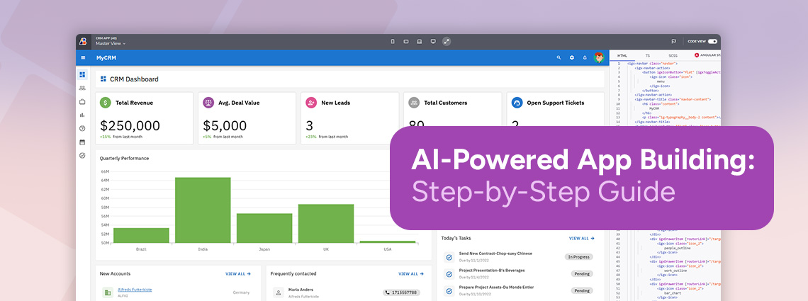

App Builder AI부터 Ignite UI MCP를 활용한 작동하는 Angular 앱까지
Angular PC 빌더 앱인 GameForge를 두 번의 이터레이션으로 구축합니다. App Builder AI로 앱을 생성하고, Claude Code, Ignite UI MCP, Ignite UI skills로 작동하게 만든 다음, Git 델타를 통해 Admin Backoffice를 추가합니다.
Georgi Anastasov 29min read
GameForge는 PC 빌더 애플리케이션입니다. 고객이 게이밍 또는 워크스테이션 PC를 구성하는 스토어프런트와, 관리자가 카탈로그, 재고, 가격, 주문을 관리하는 Backoffice로 구성됩니다. 저희는 이 애플리케이션을 두 번의 이터레이션으로 구축했습니다.
첫 번째 이터레이션에서는 App Builder AI가 빈 프로젝트에서 UI를 생성합니다. 이를 Angular로 내보내면, Claude Code가 Ignite UI MCP, Ignite UI Theming MCP, Ignite UI skills의 안내를 받아 생성된 페이지가 작동하도록 만듭니다.
두 번째 이터레이션에서는 코드가 이미 크게 발전한 후에 Admin / Backoffice 요구 사항이 추가됩니다. App Builder에서 다시 디자인하고, Git 델타를 검토한 다음, Claude가 발전된 애플리케이션에 필요한 부분만 통합하도록 합니다.
구축한 내용
- 스토어프런트: 추천 빌드 및 프리셋, 8개 슬롯의 PC Builder, 검색과 필터를 갖춘 24개 부품 카탈로그, 부품 교체, 실시간 전력, 호환성 및 가격 계산, 저장된 구성, 그리고 결제 기능을 갖춘 Build Summary.
- Backoffice: 관리자 로그인, 대시보드 지표, 주문 및 상태 관리, 그리고 스토어프런트에 즉시 반영되는 카탈로그, 재고, 가격 관리.
| 도구 | 이 워크플로에서의 역할 |
|---|---|
| App Builder AI | 프롬프트로 UI를 생성하고 다듬은 다음, Angular 프로젝트로 내보냅니다 |
| Claude Code (Opus 5.5) | 내보낸 프로젝트에 데이터, 상태, 동작을 구현합니다 |
Ignite UI MCP (igniteui-cli) | Claude가 작업하는 동안 구성 요소 문서와 API 레퍼런스를 제공합니다 |
Ignite UI Theming MCP (igniteui-theming) | 상태 색상과 상태별 스타일을 위한 테마 토큰을 제공합니다 |
| Ignite UI skills | 내보낸 프로젝트에 설치되어 사용됩니다 |
이터레이션 1: 빈 앱에서 작동하는 스토어프런트까지
다섯 개의 App Builder 프롬프트로 UI를 생성하고 다듬은 다음, 다섯 단계의 Claude Code 작업으로 앱이 작동하도록 만듭니다.
App Builder AI로 GameForge 생성하기
하나의 상세한 프롬프트로 빈 프로젝트에서 시작하기
프로젝트는 비어 있는 상태에서 시작합니다. 첫 번째 프롬프트는 앱 전체를 순서대로 설명합니다. 앱의 목적, 각 페이지와 그 콘텐츠, 데이터, 비주얼 시스템, 그리고 페이지 간 일관성을 유지하기 위한 규칙입니다.
Create a premium PC building application called GameForge with exactly three pages: Home, PC Builder, and Components.

Design GameForge as a modern high-end hardware configurator for people building custom gaming and workstation PCs. The experience should feel technical, precise and futuristic, but clean and restrained rather than full of RGB effects.

On the Home page, create a strong editorial-style hero with the GameForge brand, a bold "Build Your PC" call to action, a large premium gaming PC image, and a small set of performance highlights such as Gaming, Creator and Enthusiast. Below it, show several featured builds with large imagery, names, short specifications, prices and clear actions, followed by a compact "How It Works" section explaining the build process.

Make the PC Builder page the visual centerpiece of the application. Use a structured configurator layout with hardware categories for CPU, GPU, Motherboard, RAM, Storage, Cooling, Power Supply and Case. Show realistic sample selected parts with product imagery, model names, prices and the most important specifications. Include a visually distinct build summary area showing the selected components, a sample estimated total, a compatibility status and a clear "Review Build" action. Make selected and unselected component states easy to distinguish.

The Components page should feel like a premium hardware catalog rather than a generic product list. Include search and useful filters, and present realistic CPUs, GPUs, memory, storage and other parts using polished cards or a clean data-rich layout with product images, prices, brands, performance tiers and key specifications.

Use realistic generated hardware data throughout the app.

Use a dark graphite visual system with layered charcoal surfaces, crisp light typography and a restrained electric cyan or blue accent. Use subtle gradients, fine borders, compact technical labels, specification badges and large high-quality hardware imagery. Keep generous spacing and strong hierarchy. Avoid excessive neon, RGB gaming clichés, clutter and generic ecommerce styling.

Keep the navigation, typography, cards, buttons, spacing and visual language consistent across all three pages. The final result should feel like a polished product configurator that could realistically be used as the starting point for a working PC builder.생성된 애플리케이션 검토하기
App Builder는 세 개의 페이지와 해당 데이터, 그리고 테마를 생성했습니다.
- Home: 티어 하이라이트가 있는 히어로, 벤치마크 점수와 가격이 포함된 추천 빌드, 그리고 빌드 가이드. Build Your PC는 PC Builder를 엽니다.
- PC Builder: 빌드 텔레메트리 패널, 슬롯별 호환성 배지와 와트 수, 그리고 Review Build 대화 상자를 갖춘 8개 슬롯 구성기.
- Components: 검색, 소켓 및 성능 티어 필터, 사양 대화 상자를 갖춘 하드웨어 카탈로그.
- 데이터: 세 페이지에 데이터를 제공하는 세 개의 테이블 -
FeaturedBuild,BuilderSlot,HardwareComponent. - 테마: 차콜 표면, Space Grotesk 서체, 시안 강조 색상, 공유 상단 네비게이션 바를 갖춘 “GameForge Graphite Precision”.
크레딧: 27 (100 중 27 사용).
집중된 편집으로 PC Builder 레이아웃 다듬기
다음 프롬프트들은 앱을 다시 생성하는 대신 한 번에 앱의 한 부분만 변경합니다. PC Builder의 하드웨어 카드가 한 열로 쌓여 있었기 때문에, 이 프롬프트는 카드를 재배치하고 변경해서는 안 되는 부분을 명시합니다.
Arrange the hardware cards inside this container into a two-column grid.

Keep every existing card and all of its current content unchanged. Use two equal-width columns with consistent horizontal and vertical spacing between the cards.

Do not change the Build Telemetry or Custom Build Invoice panels on the right, and do not change anything outside this selected container.
선택한 컨테이너가 2열 그리드로 바뀌었습니다. 카드의 콘텐츠는 그대로 유지되었고, 이제 스크롤하지 않아도 더 많은 슬롯이 화면에 표시됩니다.
크레딧: 5 (100 중 32 사용).
Build Summary 페이지 추가하기
고객이 주문하기 전에 완성된 구성을 검토할 페이지가 필요합니다.
Add a new Build Summary page that matches the existing GameForge application.

This page should present the completed PC configuration in a clean summary layout. Show the selected CPU, GPU, Motherboard, RAM, Storage, Cooling, Power Supply, and Case with names, prices, and short key specifications.

Include a pricing summary area with subtotal and estimated total, a compatibility status section, and clear actions such as "Back to Builder" and "Place Order".

Keep the same dark GameForge visual style, cyan accents, and clean technical look so the page feels like a natural part of the app.
App Builder는 페이지와 해당 페이지로 이동하는 네비게이션 버튼을 추가했으며, 다른 부분의 색상은 바꾸지 않고 새로 추가된 부분의 색상만 기존 디자인에 맞췄습니다. 이 페이지에는 빌드 텔레메트리 헤더, 하드웨어 목록, 호환성 및 장착 공간 검사, 그리고 Back to Builder와 Place Order가 포함된 가격 내역이 있습니다. Claude는 5단계에서 이 페이지를 실제 결제 기능으로 바꿉니다.
크레딧: 13 (100 중 45 사용).
애플리케이션 전체 스타일 변경하기
두 문장으로 된 프롬프트로 앱 전체를 어두운 테마에서 밝은 테마로 전환합니다.
Restyle the entire GameForge application with a light high-tech design.

Change the app from the current dark look to a clean bright visual style with white and soft silver surfaces, crisp dark text, subtle dividers, and refined cyan or electric blue accents.
App Builder는 “GameForge Cryo Tech” 팔레트를 만들고 Master View와 네 개 페이지 모두의 컨테이너, 헤더, 테두리, 배지, 컨트롤에 적용했습니다.
크레딧: 7 (100 중 52 사용).
Master View에 전역 푸터 추가하기
모든 페이지가 Master View를 공유하므로 푸터는 Master View에 추가합니다.
Add a footer to the master view below the navigation and page content so it appears on every page.

Create a clean high-tech footer for GameForge with the GameForge name, a short tagline, links to Home, PC Builder, Components, and Build Summary, plus a small support/contact area.

Add a bottom line with "© 2026 GameForge. All rights reserved."

Keep it minimal, elegant, and consistent with the current light premium design.
App Builder는 브랜드, 네비게이션 링크, 지원 정보가 포함된 푸터를 추가했습니다. 결과는 “Partly there”로 보고되었는데, Direct Architecture Desk 링크가 페이지에는 있지만 아직 어디에도 연결되지 않았기 때문입니다.
크레딧: 11 (100 중 63 사용).
이터레이션 1의 App Builder 크레딧
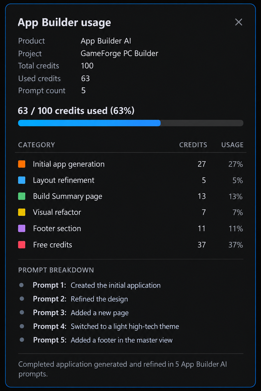
다섯 개의 프롬프트에 100크레딧 중 63크레딧이 사용되었습니다. 전체 생성에 27크레딧, 이후 각 변경에 5~13크레딧입니다. 각 요청 유형에는 고정 가격이 있으며, 생성된 페이지, 데이터 소스, 이미지에 따라 크레딧이 추가됩니다. 아래 이미지는 이 수치를 설명하기 위해 정리한 요약이며, App Builder의 실제 화면이 아닙니다.
이제 GameForge는 완성된 것처럼 보이지만, 데이터는 샘플 데이터이고 대부분의 작업은 플레이스홀더입니다. 다음 단계에서는 이를 코드로 옮깁니다.
Angular로 내보내기
App Builder는 프로젝트를 Angular 애플리케이션으로 내보냅니다. 인계는 몇 번의 클릭이면 끝납니다.
프로젝트 열기 및 AI 설정 확인하기
내보낸 프로젝트의 압축을 풀고 VS Code에서 연 다음, 종속성을 설치합니다.
npm install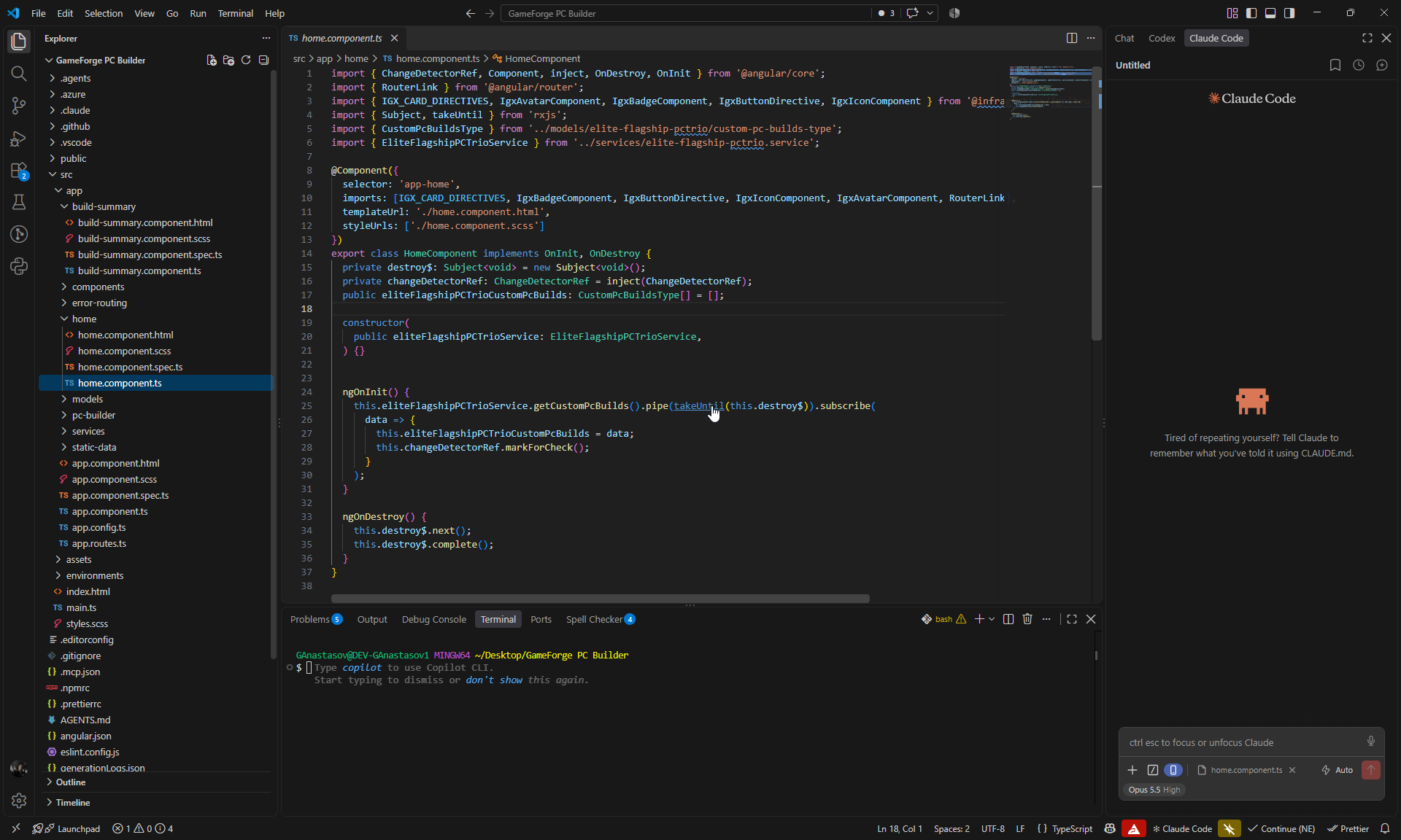
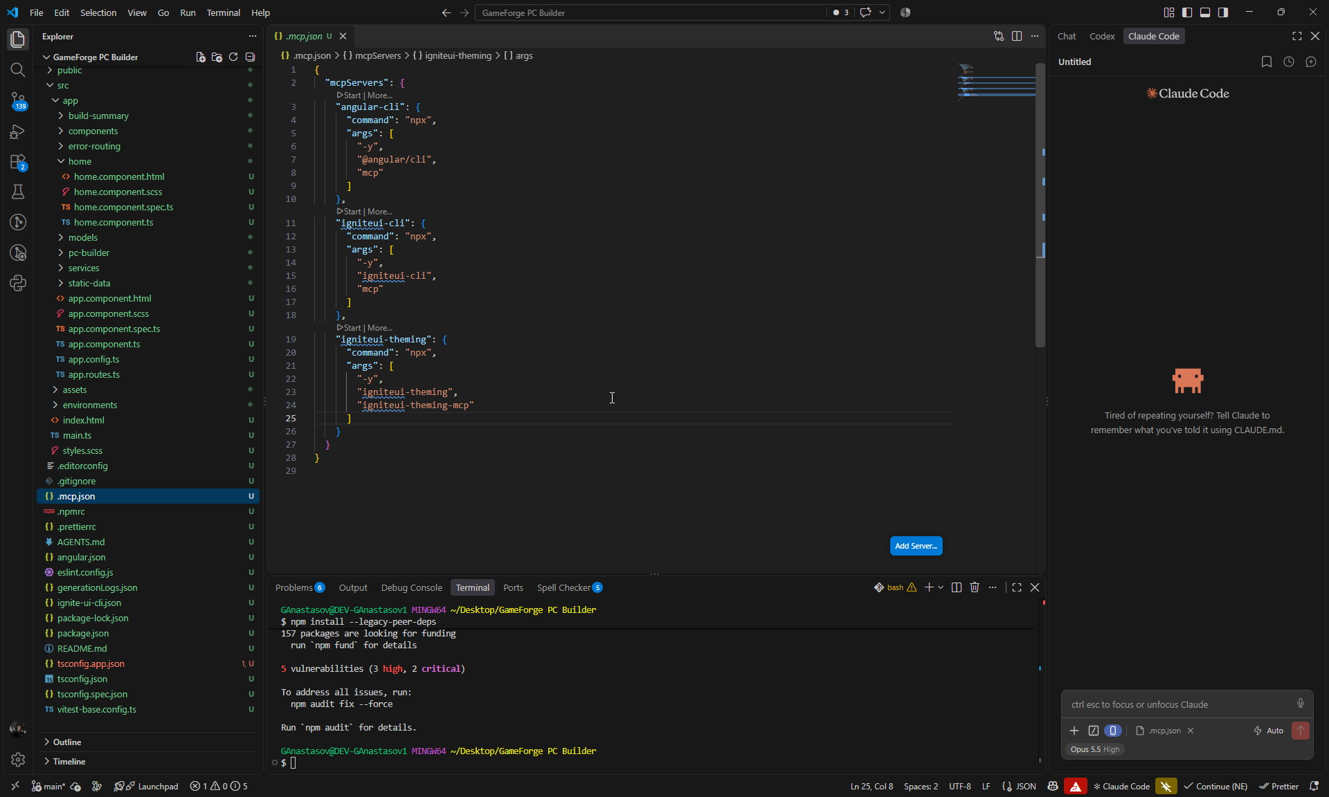
내보낸 프로젝트에는 이미 AI 설정이 포함되어 있으므로, Claude는 추가 구성 없이 바로 시작할 수 있습니다.
.mcp.json에angular-cli,igniteui-cli,igniteui-theming의 세 가지 MCP 서버가 구성되어 있습니다. 이 워크플로에서는 두 Ignite UI 서버를 사용합니다.- Ignite UI skills가 설치되어 있습니다:
igniteui-angular-components,igniteui-angular-figma-to-app,igniteui-angular-generate-from-image-design,igniteui-angular-grids,igniteui-angular-theming.
Claude Code와 Ignite UI MCP로 GameForge를 작동하게 만들기
App Builder 디자인은 그대로 유지됩니다. Claude Code는 다섯 단계에 걸쳐 그 뒤의 동작을 구축합니다.
각 프롬프트의 작성 및 검증 방식
모든 프롬프트는 Claude에게 기존 디자인을 유지하라고 지시하고, 관련된 Ignite UI 구성 요소를 명시하며, 해당 구성 요소의 Angular API는 Ignite UI MCP를 참조하도록 안내합니다. 각 단계가 끝난 후 Claude는 빌드, 린트, 단위 테스트를 실행한 다음, Playwright를 사용해 Chromium에서 변경된 흐름을 직접 실행했습니다. 모든 단계가 콘솔 오류 없이 빌드와 린트를 통과했습니다.
1단계: 실제 데이터와 공유 빌드 상태
첫 번째 프롬프트는 샘플 데이터를 실제와 같은 카탈로그로 교체하고, 네 개의 페이지 모두에 하나의 공유 빌드 상태를 제공합니다.
You are working on an Angular application called GameForge PC Builder.

This app was created in App Builder with AI and then exported. We are using it for a technical blog showing how we continue from the generated App Builder UI with Claude Code, Ignite UI MCP, Ignite UI Theming MCP, and the installed Ignite UI Claude skills to turn it into a fully working application.

The current GameForge design is already finished and should be preserved. Do not redesign the app.

The project has four main pages:
- Home
- PC Builder
- Components
- Build Summary

First inspect the existing project so you understand its generated models, services, data structures, and bindings.

Then:

- Replace the App Builder placeholder data with realistic hardware data for CPU, GPU, Motherboard, RAM, Storage, Cooling, PSU, and Case.
- Use roughly 3 parts per category.
- Include the properties needed for pricing, power, and compatibility.
- Create 3 realistic featured GameForge build presets.
- Create a shared signal-based BuildStateService that owns the selected part for each hardware slot.
- Expose selected parts, filled slot count, and subtotal as shared/computed state.
- Make Home load a selected preset into the builder.
- Make PC Builder, Components, and Build Summary use the same hardware data and shared build state.
- Preserve the existing App Builder templates and styling.

Use the Ignite UI MCP when working with or verifying Ignite UI components, and use the relevant installed Ignite UI Claude skills where useful.
Claude는 8개 카테고리별로 3개씩, 총 24개의 부품을 추가했습니다. 각 부품에는 가격, 소비 전력, 벤치마크 점수, 그리고 소켓, 메모리 유형, 폼 팩터, GPU 길이, 케이스 장착 공간 등 호환성 검사에 필요한 필드가 포함됩니다. 또한 각각 부품 가격의 합계로 가격이 책정된 세 개의 프리셋을 만들었습니다.
| 프리셋 | 티어 | 가격 |
|---|---|---|
| Apex Titan | Flagship | $4,652 |
| Vanguard | Enthusiast | $2,542 |
| Raptor | Mainstream | $2,002 |
새로운 시그널 기반 BuildStateService는 각 슬롯의 부품을 보관하고, 선택된 부품, 채워진 슬롯 수, 소계, 활성 프리셋을 노출합니다. Home은 이 서비스에 프리셋을 로드하고, 나머지 세 페이지는 이 서비스에서 데이터를 읽습니다.
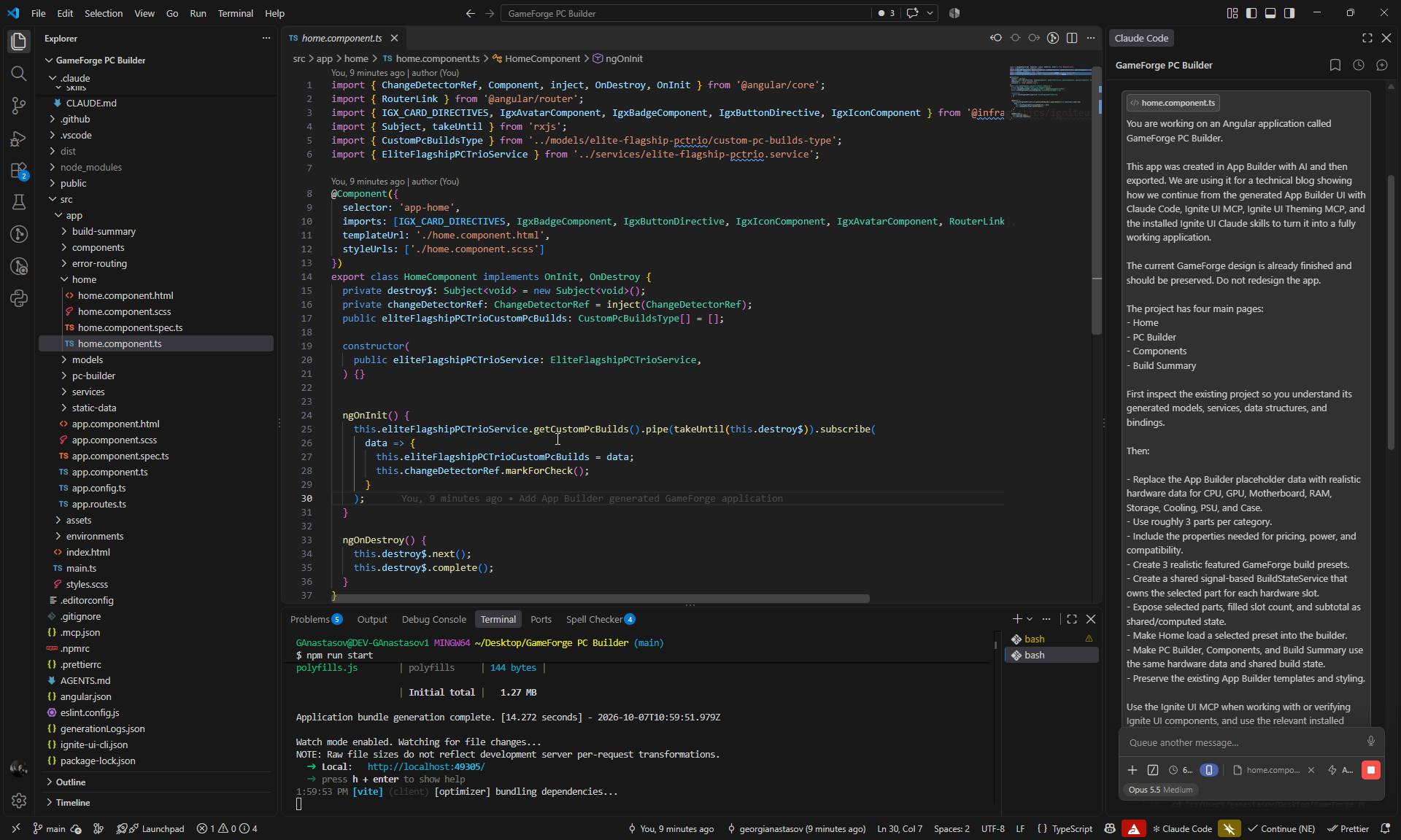
새 모델은 생성된 모델을 확장하므로 App Builder 템플릿의 바인딩은 그대로 유지되었습니다. Claude는 더 이상 사용되지 않는 생성된 서비스 세 개와 해당 플레이스홀더 데이터를 제거하고, 페이지 구성 요소를 OnPush, inject(), 시그널 방식으로 전환했습니다.
데이터에는 4단계에서 감지할 수 있도록 의도적인 충돌도 포함되어 있습니다. AMD 부품과 함께 있는 Intel CPU와 보드, 그리고 163 mm NZXT H6 Flow 케이스에 들어가지 않는 168 mm Noctua NH-D15 G2 쿨러입니다.
배지, 선형 진행률 표시줄, Grid Lite를 바인딩하기 전에 Claude는 Ignite UI MCP를 통해 해당 API를 확인했습니다. 스타일 변경이 없었기 때문에 Theming MCP는 호출하지 않았습니다.
검사: 단위 테스트 12개 통과, MCP 호출 3회.
2단계: 작동하는 카탈로그 필터
다음으로 Components 페이지에 작동하는 필터를 추가합니다. 프롬프트는 Claude가 조회해야 할 각 Ignite UI 구성 요소를 명시합니다.
Make the existing Components page fully functional without changing its current design.

Use the Ignite UI MCP as the source of truth for the Angular APIs of the existing input, igx-select, igx-chip, dialog and snackbar components. Use the relevant installed Ignite UI Claude skills where useful.

Implement:

- Working search by part name, manufacturer and relevant specifications.
- Working Component Category filter.
- Working Performance Tier filter.
- Working Socket / Form Factor filter.
- Working Sort By.
- Make the existing quick-filter chips selectable and functional.
- Make Reset Filters clear all active filters and restore the full catalog.
- Update the visible component count automatically.
- Show a clear empty state when no parts match.

Use signals/computed state for the filtering and preserve the existing cards, layout, styling and hardware data.

Do not redesign the page or replace existing Ignite UI components unnecessarily.
이제 검색은 이름, 제조사, 카테고리, 티어, 소켓 또는 폼 팩터, 사양을 기준으로 일치하는 항목을 찾습니다. igx-select 드롭다운은 시그널에 바인딩되고, 빠른 필터 칩은 조합할 수 있으며(Processors + GPUs를 선택하면 6개 부품이 표시됨), “N Components Verified” 개수는 실시간으로 업데이트되고 스크린 리더에도 안내되며, 일치하는 항목이 없으면 자체 Reset Filters 버튼이 있는 빈 상태가 표시됩니다.
Ignite UI MCP의 API 레퍼런스는 칩 이벤트(onSelection)와 스낵바 메서드(show/hide)에 대해 이전 이름을 반환했습니다. Claude는 이를 MCP 칩 가이드 및 설치된 타입 정의와 대조해 확인한 후, 대신 selectedChanging, [selected], open(), close()를 사용했고, 이후 단계를 위해 이 내용을 메모리에 저장했습니다.
Claude는 프롬프트에서 요청하지 않은 부분도 변경했습니다. 스낵바 메시지, Review Rig 버튼, Benchmarks 대화 상자, Add to Custom Build입니다. 이러한 변경은 유용했지만 다음 단계와 겹쳤기 때문에, 이후 프롬프트는 범위를 제한하는 문장으로 끝납니다.
검사: 단위 테스트 18개 통과, MCP 호출 5회.
3단계: PC Builder에서 부품 교체하기
이 프롬프트는 부품 교체 기능을 추가하여, 고객이 PC Builder에서 현재 빌드의 부품 하나를 교체할 수 있도록 합니다. 마지막 문장이 범위 제한입니다.
Connect PC Builder and Components so users can replace a specific hardware part in their current build.

Preserve the existing design and the filtering functionality that already works.

Use the Ignite UI MCP when working with or verifying the relevant Angular component APIs, and use the relevant installed Ignite UI Claude skills where useful.

Implement:

- Make each existing Change Part action in PC Builder open `/components?slot=<slot>` for the correct hardware slot.
- On Components, read the `slot` query parameter and automatically filter the catalog to that hardware category.
- Clearly show which current part is being replaced.
- Mark the part that is already selected in the build.
- Make Select for Rig replace the part in that exact slot through BuildStateService.
- After replacement, show the existing confirmation snackbar with the old and new part names.
- Make Review Rig return to PC Builder, where the changed part and subtotal are immediately reflected.
- Make direct navigation to Components without a slot continue to behave as the normal full catalog.

Do not redesign anything and do not rework the existing filters, dialogs or snackbar behavior unless required for this flow.
이제 각 Change Part 버튼은 해당 슬롯으로 필터링된 Components를 엽니다(예: /components?slot=gpu). 배너에 교체 중인 부품이 표시되고, 현재 부품에는 “In Your Rig” 표시가 붙으며, Select for Rig는 해당 슬롯의 부품을 교체합니다. 스낵바가 교체를 확인해 주고(“RTX 5080 replaced RTX 5090 in the GPU slot.”), Review Rig를 누르면 PC Builder로 돌아가며, 소계는 $4,652에서 $3,652로 줄어듭니다. 슬롯 없이 Components를 열면 여전히 전체 카탈로그가 표시됩니다.
배너는 처음에 테마의 가장 밝은 기본 색상 음영을 사용했지만, 그 위의 캡션 텍스트가 대비 기준을 충족하지 못했습니다. Claude는 기본 색상과 표면 색상을 혼합한 틴트로 변경했습니다.
검사: 단위 테스트 21개 통과, MCP 호출 1회.
4단계: 실시간 전력, 호환성, 가격
PC Builder는 여전히 하드코딩된 텔레메트리를 표시합니다. 이 프롬프트는 이를 실시간 계산으로 대체하고, 성공, 경고, 오류 상태를 위해 Ignite UI Theming MCP를 활용합니다.
Make the existing PC Builder telemetry, compatibility and pricing fully functional using the shared BuildStateService.

Preserve the current GameForge design and existing components.

Use the Ignite UI MCP as the source of truth for the Angular APIs of the existing IgxBadge, IgxLinearProgressBar, dialog and snackbar components.

Use the Ignite UI Theming MCP with platform "angular" to inspect the correct theme tokens and visual states for success, warning and error. Use the relevant installed Ignite UI component and theming skills where useful.

Implement live calculations for:

- total estimated power draw;
- PSU capacity, utilisation and remaining headroom;
- parts subtotal and build total;
- CPU and motherboard socket compatibility;
- RAM and motherboard compatibility;
- motherboard and case form factor compatibility;
- GPU length and case clearance;
- cooling and case compatibility;
- PSU capacity;
- whether all required hardware slots are populated.

Replace the existing hard-coded PC Builder values with these calculations.

Make the existing badges and progress bar react to the current build with clear success, warning and failure states based on the Ignite UI MCP and Theming MCP guidance.

Update the existing Review Build dialog so it shows the real 8 selected parts, current pricing, power information and any compatibility issues.

Make the existing assembly/testing options affect the calculated total.

Make Save Configuration actually persist the current build and restore it after a page reload.

Keep the implementation focused on the existing UI and do not redesign the page.
이제 PC Builder는 현재 빌드를 기반으로 다음 값을 계산합니다.
- 전력: Apex Titan 프리셋은 1200 W PSU에서 825 W를 소비하므로 “375W (31% buffer)“가 남습니다. 부하 80%까지는 성공, 80-100%는 경고, 100% 초과는 오류이며, 진행률 표시줄 자체의 상태를 통해 설정됩니다.
- 호환성: 8개의 검사가 빈 슬롯, CPU 소켓, RAM 유형, 메인보드 크기, GPU 길이, 쿨러 장착 및 마운팅, PSU 용량을 확인합니다. 빈 슬롯에 의존하는 검사는 실패 대신 대기 중으로 표시됩니다.
- 가격: 소계, 조립 티어, 열 튜닝 옵션이 예상 총액을 결정합니다.
- Review Build: 대화 상자에 실제 부품, 전력, 가격, 문제가 나열됩니다. 충돌이나 빈 슬롯이 있는 동안에는 Proceed to Checkout이 비활성화됩니다.
- Save Configuration: 빌드가 브라우저에 저장되고 새로 고침 시 복원됩니다. 더 이상 카탈로그와 일치하지 않는 저장된 항목은 무시됩니다.
경고 및 오류 색상은 Theming MCP를 통해 찾은 테마의 warn 및 error 토큰을 사용하며, 패널에서 WCAG AA 대비 기준을 통과합니다. 옵션 가격(Precision Stress-Testing $49, Extreme Benchmarking & Burn-in $149, Precision Thermal Tuning $79)은 Claude가 기존 문구를 바탕으로 정한 데모 값입니다.
검사: 단위 테스트 36개 통과, MCP 호출 7회(Ignite UI MCP 2회, Theming MCP 5회).
5단계: Build Summary 및 결제
Build Summary는 플레이스홀더 값이 남아 있는 마지막 페이지입니다. 이 프롬프트는 이 페이지를 결제 페이지로 바꾸고, 원시 Grid Lite 웹 구성 요소를 Angular 구성 요소로 교체합니다.
Make the existing Build Summary page fully functional and synchronize it with the shared GameForge build state.

Preserve the current design and reuse the existing Ignite UI components.

Use the Ignite UI MCP as the source of truth for the Angular APIs of:
- IgxGridLiteComponent
- grid data binding, columns, sorting, filtering and cell templates
- IgxBadge
- IgxDialog
- IgxSelect
- IgxSnackbar

Use the igniteui-angular-grids and igniteui-angular-components skills where useful. Use the Ignite UI Theming MCP with platform "angular" only if status styling needs theme/token work.

Implement:

- Make Build Summary show the exact same selected parts, slot count, power, compatibility and pricing as PC Builder.
- Remove the remaining hard-coded summary values.
- Replace the current raw Grid Lite web component with the Angular IgxGridLiteComponent.
- Populate the grid from the real compatibility checks and use clear columns with pass/warning/fail status badges.
- Keep sorting and filtering working.
- Make shipping and payment selections functional.
- Calculate shipping, tax, payment discount and final total live.
- Use the existing checkout dialog with proper validation.
- Prevent ordering when the build is incomplete or has compatibility failures.
- Make Confirm & Place Order create a simple order id/snapshot, close the dialog, show the existing snackbar, and display an Order Confirmed state.
- Add a Start New Build action that resets the current build.
- Make Proceed to Checkout from PC Builder open Build Summary with the same current build.

Do not redesign the page or replace existing components unnecessarily.
이제 Build Summary는 PC Builder와 동일한 빌드를 표시합니다. Apex Titan의 경우 PC Builder의 $4,701은 요약에 표시된 하드웨어 $4,652에 테스트 비용 $49를 더한 금액과 같습니다.
- 호환성 그리드:
igc-grid-lite웹 구성 요소가 AngularIgxGridLiteComponent로 교체되었으며,igx-badge상태 열과 함께 8개의 검사를 표시합니다. 모든 열에서 정렬과 필터링이 작동합니다. - 결제: 배송과 결제 수단 선택에는 반응형 폼 안의 기존
igx-select구성 요소를 사용합니다. 배송비, 계좌 이체 할인, 세금, 총액이 실시간으로 업데이트됩니다(데모 요율). - 주문: 빌드가 불완전하거나 호환성 검사에 실패하면 Place Order와 Confirm이 비활성화되고 그 이유가 표시됩니다. Confirm & Place Order는
GF-MUY3L5KH-2QO4와 같은 주문 ID와 Order Confirmed 상태를 생성하며, Start New Build는 빌드를 초기화합니다.
igniteui-angular-grids 스킬은 Grid Lite 설정, 임포트, 셀 템플릿, Angular 래퍼를 안내했습니다. 새로운 가격 규칙은 원래 App Builder 청구서의 총액 $3,086.37을 정확히 재현합니다. 단위 테스트는 1센트 반올림 오류도 잡아냈습니다. $1,079의 1.5%가 $16.19가 아닌 $16.18로 계산되었던 것입니다.
검사: 단위 테스트 45개 통과, MCP 호출 4회.
숫자로 보는 이터레이션 1
바로 이 지점에서 워크플로의 효과가 나타나기 시작합니다. 다섯 개의 App Builder 프롬프트와 63크레딧으로 GameForge는 빈 프로젝트에서 완성도 높은 네 페이지 디자인이 되었습니다. 이어서 집중된 다섯 단계의 Claude Code 작업이 이 디자인을 작동하는 스토어프런트로 바꾸었습니다. 실제 카탈로그, 공유 빌드 상태, 필터링, 부품 교체, 실시간 전력 및 호환성 검사, 가격 계산, 저장된 구성, 결제 기능이 포함됩니다. 최종적으로 45개의 단위 테스트가 통과하며, 모든 단계의 변경 사항은 브라우저에서 확인되었습니다.
다섯 단계에 걸쳐 Claude는 20회의 MCP 호출(Ignite UI MCP 15회, Theming MCP 5회)을 수행했고 Ignite UI skills도 사용했습니다. 이 호출은 구성 요소 API, Grid Lite, 빌드 상태에 반응하는 배지와 진행률 표시줄, 그리고 상태 색상의 기반이 되는 테마 토큰을 다루었습니다. 각 답변은 에이전트가 해당 정보가 필요한 코드를 작성하는 시점에 전달되었으므로, 구성 요소에 대한 지식이 곧바로 작동하는 기능으로 이어졌습니다.
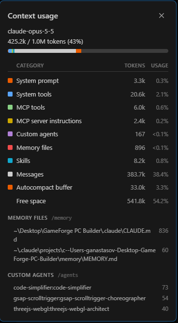
세션 종료 시점의 컨텍스트 창(Claude Code, Opus 5.5, 1M 토큰):
| 범주 | 토큰 | 비율 |
|---|---|---|
| 사용된 컨텍스트 | 425.2k | 43% |
| 메시지 | 383.7k | 38.4% |
| MCP 도구 | 6.0k | 0.6% |
| MCP 서버 지침 | 2.4k | 0.2% |
| 스킬 | 8.2k | 0.8% |
| 여유 공간 | 541.8k | 54.2% |
이러한 도움은 공간을 거의 차지하지 않았습니다. MCP 도구와 서버 지침은 8.4k 토큰으로 컨텍스트 창의 1% 미만을 사용했습니다. 이 표는 컨텍스트 창의 스냅샷이며, 세션에서 소비한 총 토큰 수가 아닙니다.
이터레이션 1은 완전하고 작동하는 Angular 애플리케이션으로 마무리됩니다. 열 개의 프롬프트로 GameForge는 아이디어에서 테스트를 거친 스토어프런트가 되었습니다. UI를 위한 App Builder 프롬프트 다섯 개, 그리고 동작을 위한 Ignite UI MCP 기반 Claude Code 프롬프트 다섯 개입니다.
이터레이션 2: Admin Backoffice 추가하기
이터레이션 1이 끝나면 GameForge는 작동합니다. 고객은 빌드를 구성하고, 호환성을 확인하고, 주문할 수 있습니다. 하지만 실제 프로젝트는 이 지점에서 멈추는 경우가 거의 없습니다. 첫 버전이 완성된 후에도 새로운 요구 사항이 생기고, 디자인이 바뀌며, 새로운 기능은 처음 생성된 것보다 훨씬 발전한 코드에 맞춰 들어가야 합니다.
저희는 이 상황을 의도적으로 재현합니다. 새로운 요구 사항은 구성 요소, 가격, 재고 및 판매 가능 여부, 고객 주문을 관리하기 위한 Admin / Backoffice 경험입니다.
App Builder로 돌아가 새 화면을 디자인한 다음, App Builder의 변경 사항만을 Claude가 이미 구축한 Angular 애플리케이션의 입력으로 사용합니다. Ignite UI MCP 서버와 skills를 갖춘 Claude Code는 이터레이션 1의 작업을 덮어쓰지 않고 새로운 기능을 기존 아키텍처에 통합합니다.
다음 이터레이션 준비하기
Admin 작업을 시작하기 전에 두 버전의 프로젝트를 모두 GitHub에 올립니다.
Claude 프로젝트를 GitHub에 게시하기
이터레이션 1의 모든 작업이 포함된 Angular 프로젝트는 별도의 자체 리포지토리에 올립니다. 이 프로젝트는 계속해서 메인 프로젝트이자 기준 원본으로 유지됩니다.
App Builder 베이스라인 게시하기
App Builder 프로젝트는 App Builder에서 새로운 변경을 하기 전에 별도의 리포지토리에 올립니다.
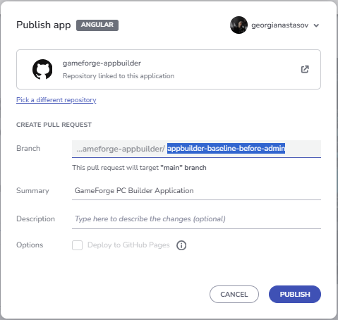
App Builder는 프로젝트를 main을 대상으로 하는 Pull Request(여기서는 Pull Request #1)로 게시하며, 이 Pull Request는 Admin 작업을 시작하기 전에 병합합니다. 베이스라인이 main에 있으므로, App Builder가 Admin 요구 사항을 위해 생성하는 모든 내용은 베이스라인과 비교한 깔끔한 diff로 표시됩니다.
새로운 요구 사항: Admin Backoffice
관리자에게는 카탈로그, 재고, 가격, 고객 주문을 관리할 영역이 필요합니다. App Builder에서는 네비게이션의 Admin 항목, Admin Login 페이지, Backoffice 페이지가 이에 해당합니다. Angular 애플리케이션은 내보낸 이후 많이 변경되었기 때문에, 업데이트된 App Builder 프로젝트를 여기에 병합하지 않습니다. 대신 다음과 같이 진행합니다.
- App Builder 프로젝트에 Admin 페이지를 추가합니다.
- 업데이트를 Pull Request와 함께 새 브랜치에 게시합니다.
- GitHub에서 브랜치를 베이스라인과 비교하여 정확한 델타를 확인합니다.
- 메인 프로젝트에서 두 App Builder 상태를 모두 가져오고 Git으로 델타를 검토합니다.
- Claude Code가 기존 기능을 덮어쓰지 않고 Admin 관련 변경 사항만 통합하도록 합니다.
- 새 Admin UI를 기존 데이터, 주문, 상태에 연결합니다.
App Builder에서 Admin 경험 구축하기
두 번째 이터레이션은 37크레딧이 남은 상태에서 시작하며, 세 개의 프롬프트를 사용합니다.
네비게이션에 Admin 항목 추가하기
Add a new Admin entry at the far right of the existing top navigation bar.

Use a clear admin-style icon together with the label "Admin".

Keep it visually consistent with the current GameForge navigation and overall light high-tech design.

When clicked, it should navigate to a new page called "Admin Login".
App Builder는 Master View 네비게이션의 맨 오른쪽에 관리자 아이콘이 있는 Admin 버튼을 추가했습니다. 공유 헤더에 있으므로 모든 페이지에 표시되며, Backoffice 흐름의 시작점이 됩니다.
크레딧: 5 (100 중 68 사용).
Admin Login 페이지 생성하기
Add a new page called "Admin Login".

Create a clean, modern login page for the GameForge backoffice that matches the existing light high-tech design.

Use the same container-based layout approach as the rest of the application so the page feels fully consistent with the existing structure, spacing, and alignment.

Place the login content inside a centered main container with a focused inner login panel.

Include:
- GameForge / Backoffice branding
- "Admin Login" title
- short subtitle explaining that this area is for administrators
- Email field
- Password field
- prominent Sign In button
- secondary Back to Store action

Keep the page simple, polished, and visually consistent with the rest of the GameForge application.
App Builder는 GameForge의 밝은 테마로 가운데 정렬된 인증 레이아웃을 갖춘 Admin Login 페이지를 만들었으며, 여기에는 로그인 필드와 Back to Store 작업이 포함됩니다. 또한 Admin 항목을 이 페이지에 연결했습니다.
크레딧: 11 (100 중 79 사용).
Admin Backoffice 페이지 생성하기
Add a new page called "Admin Backoffice".

Create a polished, modern administration dashboard for managing the entire GameForge application.

The page should feel like a real backoffice product, not just a regular content page. It should be easy to scan, easy to operate, and visually consistent with the existing GameForge light high-tech design.

Use the same container-based layout approach, spacing, cards, typography, borders, and overall visual language as the rest of the application.

Structure the page around one clear main admin workspace with these areas:

1. Admin Overview
Create a compact dashboard header and summary cards for:
- Total Orders
- Pending Orders
- Revenue
- Low Stock Components

2. Orders Management
Add a clear, data-rich management section where administrators can quickly review and manage customer orders.

Show:
- Order ID
- Customer
- Date
- Total
- Payment
- Status
- Actions

Use clear status badges and make each order easy to review or update.

3. Components Management
Add a dedicated hardware management section for maintaining the PC component catalog.

Show:
- Component image
- Component name
- Category
- Price
- Stock
- Availability
- Actions

Include prominent actions for:
- Add Component
- Edit Component
- Delete Component
- Update price
- Update stock
- Change availability

Make the page feel operational and practical, with strong hierarchy, clear actions, and well-separated management areas.

The final result should look like a professional GameForge admin dashboard from which an administrator could manage the store, hardware catalog, inventory, and customer orders.
App Builder는 앱의 나머지 부분과 동일한 비주얼 스타일로 개요 지표, Orders Management, Components Management, 재고 관리 컨트롤을 갖춘 Backoffice 대시보드를 만들었습니다. 이후의 통합은 이 구조를 기반으로 진행됩니다.
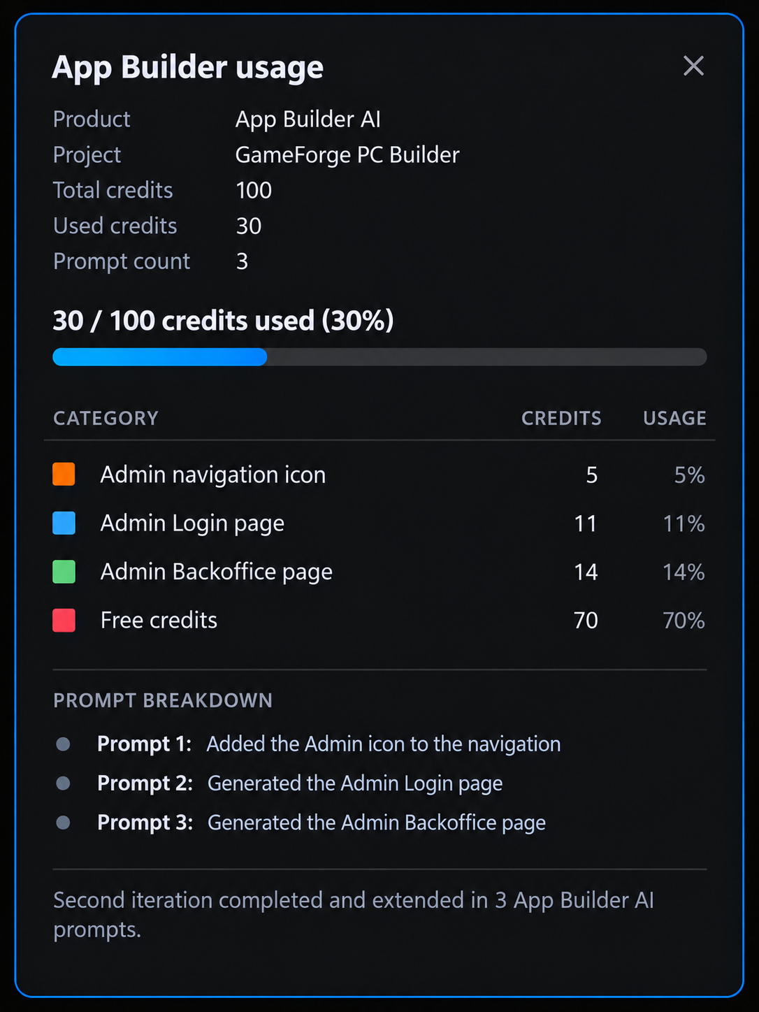
크레딧: 14 (100 중 93 사용). Admin 경험에 남은 37크레딧 중 30크레딧이 사용되었습니다.
업데이트를 브랜치에 게시하고 GitHub에서 비교하기
업데이트된 App Builder 프로젝트는 Pull Request와 함께 별도의 브랜치에 올립니다. GitHub는 이를 베이스라인과 비교하여 App Builder가 Admin 요구 사항을 위해 추가하거나 변경한 내용을 정확히 보여줍니다.
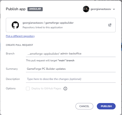
Admin 델타를 메인 프로젝트로 가져오기
두 프로젝트는 별도의 리포지토리에 유지되며, 델타 중 유용한 부분만 가져옵니다.
Git으로 델타 검토하기
메인 프로젝트에서 다음 명령은 아래 작업을 수행합니다.
- 최신 상태의
main에서 통합 브랜치ganastasov/admin-backoffice-integration을 만듭니다. - App Builder 리포지토리를 두 번째 원격 저장소
appbuilder로 추가합니다. - 베이스라인(
appbuilder/main)과 Admin Pull Request(#2)를 로컬 브랜치appbuilder-admin으로 가져옵니다. - 두 App Builder 상태 사이에 변경된 파일을 파일별 변경 요약과 함께 표시합니다.
git checkout main
git pull origin main
git checkout -b ganastasov/admin-backoffice-integration

git remote add appbuilder https://github.com/georgianastasov/gameforge-appbuilder.git
git remote -v

git fetch appbuilder main
git fetch appbuilder pull/2/head:appbuilder-admin

git diff --name-status appbuilder/main..appbuilder-admin
git diff --stat appbuilder/main..appbuilder-admin
이 명령은 Admin Pull Request(#2)가 아직 열려 있을 때 실행했습니다. 이후 병합되었으므로 현재 appbuilder/main에는 Admin 변경 사항이 포함되어 있어 더 이상 베이스라인 역할을 하지 않습니다. 병합 후에 같은 비교를 하려면 베이스라인 Pull Request(pull/1/head)를 가져와 그것과 비교하세요.
App Builder의 어떤 내용도 메인 프로젝트에 병합하지 않습니다. 병합하면 1단계에서 제거한 서비스를 포함해 생성된 코드가 발전된 애플리케이션을 다시 덮어쓰게 됩니다. 델타를 검토하는 방식은 메인 프로젝트를 기준 원본으로 유지합니다.
Admin 경험 통합하기
하나의 구현 프롬프트로 남은 결정 사항을 확정하고 통합을 요청합니다.
The analysis looks good. Proceed with the integration.

Use these decisions:

- Add Component should support the full hardware data required by the existing compatibility system. Make the additional specification fields category-aware where appropriate so an admin is not presented with irrelevant fields.
- Add a Customer Name field to the existing checkout flow so newly placed orders can display a real customer name in the Admin Backoffice.
- Use one simple demo admin credential for this application. This is demo client-side authentication, not production security.
- Inventory must affect the storefront. Admin stock and availability changes should be reflected in the customer-facing Components / PC Builder experience.

Implement the Admin experience using the current application as the source of truth.

Use the App Builder delta as the visual/design source for:
- Admin navigation entry;
- Admin Login;
- Admin Backoffice layout and styling.

Do not copy the generated placeholder services, static data, or duplicate hardware model architecture.

Implement the integration properly using the existing application architecture and conventions.

The final flow should support:

- Admin login and guarded Backoffice access.
- Admin logout/session handling.
- Real overview KPIs derived from application state.
- Order history containing seeded demo orders and newly placed customer orders.
- Customer name, payment status, and fulfillment status.
- Admin order status management.
- Inventory management per hardware part.
- Stock and availability updates.
- Hardware price editing.
- Adding new hardware components with the specifications required by the compatibility system.
- Discontinuing/removing components safely without breaking existing presets or saved builds.
- Admin catalog changes reflected in the customer storefront.
- Admin inventory changes reflected in the customer storefront.
- Existing PC Builder, compatibility, pricing, saved builds, Build Summary, and checkout behaviour must continue to work.

Follow the current project conventions:
- signals where appropriate;
- `inject()`;
- `ChangeDetectionStrategy.OnPush`;
- reactive forms;
- lazy-loaded admin routes;
- existing Ignite UI patterns and components.

Use Ignite UI MCP and the installed Ignite UI skills when they are useful for component APIs, grids, dialogs, forms, exporters, or other Ignite UI implementation details. Validate any MCP information against the installed project version when necessary.

Preserve the visual design generated by App Builder as closely as practical while adapting its behaviour to the current architecture.

Add or update tests for the new functionality and run the existing test suite, build, and lint checks.

After implementation, report:
- files added or changed;
- how the App Builder delta was adapted;
- how the new Admin state connects to the existing storefront;
- tests/build/lint results;
- Ignite UI MCP or skill usage during this implementation.
Claude는 App Builder에서 HTML, SCSS, 레이아웃, 아이콘, 시각적 구조를 가져왔습니다. 생성된 플레이스홀더 서비스, 중복 모델, 정적 데이터는 복사하지 않았으며, 생성된 로직은 프로젝트의 규칙에 맞게 다시 작성했습니다. 이 통합에는 로그인, 대시보드, 주문 관리 외에도 새 구성 요소를 위한 카테고리별 사양 필드, 영구 주문 기록, 그리고 부품을 삭제하는 대신 사용하는 Discontinue / Restore 기능이 추가되었습니다.
스토어프런트와 Backoffice 연결하기
Backoffice와 스토어프런트는 동일한 상태를 공유하므로 변경 사항이 양방향으로 전달됩니다.
- 가격을 수정하면 PC Builder, Build Summary, Home 프리셋 가격, Components가 업데이트됩니다.
- 새 구성 요소는 스토어프런트에 즉시 표시됩니다.
- 단종된 구성 요소는 새로 선택할 수 없도록 숨겨지지만, 기존 빌드, 프리셋, 이전 주문에는 그대로 남아 있습니다.
- 재고와 판매 가능 여부에 따라 고객이 선택할 수 있는 항목이 결정되며, 빌드에 판매할 수 없는 부품이 있으면 결제가 차단되고 교체해야 할 부품이 표시됩니다.
- 이제 결제 시 Customer Name을 입력받고, 재고를 차감하며, Backoffice에 주문을 생성합니다.
전체 흐름 검증하기
전체 시나리오를 Chromium에서 테스트했습니다.
- Backoffice를 열면 Admin Login으로 리디렉션됩니다.
- 잘못된 자격 증명을 입력하면 오류가 표시됩니다.
- 관리자가 로그인합니다.
- 새 RTX 5070 Ti를 추가합니다.
- RTX 5090의 가격을 $1,899로 변경하고 재고를 0으로 설정합니다.
- 스토어프런트에 새 가격과 “Out of Stock”이 즉시 표시됩니다.
- 선택된 RTX 5090을 구매할 수 없으므로 Build Summary에서 결제가 차단됩니다.
- 구성 요소의 재고를 다시 채웁니다.
- “Jordan Lee”라는 고객이 결제를 완료합니다.
- 새 주문이 Admin Backoffice 주문 그리드의 맨 위에 표시됩니다.
- Sign Out을 클릭하면 Home으로 돌아갑니다.
이 흐름은 콘솔 오류 없이 실행되었고, 린트에 문제가 없으며, 프로덕션 빌드도 성공합니다.
숫자로 보는 이터레이션 2
두 번째 이터레이션은 프로젝트가 진행된 이후에도 이 워크플로가 계속 효과적이라는 것을 보여줍니다. 세 개의 App Builder 프롬프트와 30크레딧을 추가로 사용해 완전한 Admin / Backoffice 경험을 디자인했습니다. 네비게이션 항목, 로그인 페이지, 그리고 주문, 구성 요소, 재고를 위한 대시보드입니다. 그런 다음 Git 델타를 통해 이 디자인을, 내보낸 이후 많이 변경된 애플리케이션으로 가져왔으며, 이터레이션 1의 작업은 전혀 덮어쓰지 않았습니다.
| 지표 | 이터레이션 2 |
|---|---|
| App Builder 크레딧 | 30 (두 이터레이션 합계 100 중 93) |
| 단위 테스트 | 이전 45개, 이후 105 / 105 (+60) |
| Ignite UI MCP 호출 | 5 |
| Ignite UI Theming MCP 호출 | 2 |
| 총 Ignite UI MCP 호출 | 7 |
| 사용된 스킬 | igniteui-angular-grids |
Claude Code, Ignite UI MCP 서버, 그리고 igniteui-angular-grids 스킬은 생성된 Admin 페이지를 앱의 나머지 부분과 연결된 작동하는 기능으로 바꾸었습니다. 그리드 스킬은 Admin igx-grid 설정, 임포트, igxCell 템플릿, 행 선택, Excel 스타일 필터링, CSV 내보내기, 크기 조정을 안내했고, Theming MCP는 디자인 토큰을 제공했습니다. 폼과 대화 상자에는 MCP의 직접적인 도움이 필요하지 않았으며, 접근성은 브라우저 및 axe 테스트로 확인했습니다. 이터레이션 1에서 Ignite UI 패턴이 이미 자리 잡았기 때문에 7회의 MCP 호출로 충분했습니다.
테스트 스위트는 통과 테스트 45개에서 105개로 늘어났습니다. Backoffice에서 변경한 가격, 재고, 카탈로그는 즉시 스토어프런트에 반영되고, 고객 주문은 다시 Backoffice로 전달됩니다.
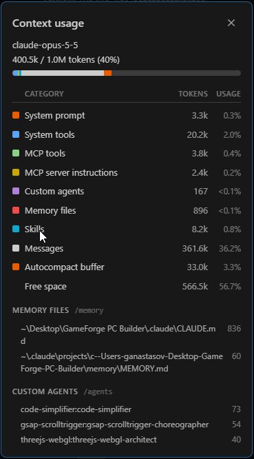
Admin 세션 종료 시점에 컨텍스트 창은 1M 토큰 중 400.5k(40%)를 사용하고 있었습니다. MCP 도구와 서버 지침은 6.2k 토큰(약 0.6%), 스킬은 8.2k(0.8%)를 차지했습니다.
세 개의 App Builder 프롬프트와 하나의 Claude 구현 프롬프트로 작동하는 스토어프런트에 작동하는 Backoffice를 추가했습니다. 이 워크플로는 애플리케이션을 처음 만들 때만큼이나, 새로운 요구 사항이 생겼을 때 애플리케이션을 확장하는 데에도 유용합니다.
이터레이션 1과 마찬가지로, 아래의 App Builder 크레딧 이미지는 설명을 위한 요약이며 App Builder의 실제 화면이 아닙니다.
App Builder와 Ignite UI MCP가 함께 잘 작동하는 이유
App Builder AI와 Ignite UI MCP는 같은 작업의 서로 다른 절반을 담당하며, GameForge는 두 도구가 얼마나 잘 어울리는지 보여줍니다.
App Builder는 비용이 많이 드는 초기 단계를 담당합니다. 빈 프로젝트에서 다섯 개의 프롬프트로 페이지, 레이아웃, 네비게이션, Ignite UI 구성 요소, 데이터 구조, 스타일, 그리고 모든 뷰에 걸친 일관된 경험을 갖춘 구조화된 애플리케이션을 만들었습니다. 코딩 에이전트는 그 구조를 처음부터 만들어 낼 필요가 없었습니다. 실제 기반에서 시작했기 때문입니다. 또한 App Builder는 표준 Angular 프로젝트를 내보내고 GitHub에 게시하므로, 작업은 시각적 도구 안에 머무르지 않고 평소의 개발 워크플로에서 일반적인 코드 프로젝트로 이어집니다.
Ignite UI MCP는 인계 시점부터 역할을 넘겨받습니다. Claude는 작동하는 코드베이스에서 시작하며, MCP 서버는 Claude에게 필요한 Ignite UI 문서, 구성 요소 API, 테마 토큰에 직접 접근할 수 있게 해 줍니다. 에이전트는 UI를 다시 구축하는 대신 데이터, 상태, 비즈니스 규칙, 통합, 반복 작업에 컨텍스트를 사용할 수 있습니다. 올바른 칩 이벤트, Grid Lite 설정, warn 및 error 토큰이 필요할 때 추측하지 않고 직접 조회했습니다. MCP 도구와 서버 지침은 두 세션 모두에서 컨텍스트 창의 1% 미만에 머물렀습니다.
두 번째 이터레이션은 가장 강력한 증거입니다. 코드베이스가 처음 내보낸 버전에서 크게 발전한 후에도 App Builder는 완전한 Admin / Backoffice 영역을 디자인했고, Git은 변경된 내용을 정확히 분리했으며, Claude는 스토어프런트를 손상시키지 않고 이를 통합했습니다. 두 이터레이션에 걸쳐 GameForge에는 8개의 App Builder 프롬프트와 100크레딧 중 93크레딧이 사용되었습니다. 최종 결과는 실시간 가격 계산, 호환성 검사, 재고, 결제, 그리고 Admin과 스토어프런트 사이를 오가는 주문을 갖춘 완전한 스토어프런트와 Backoffice이며, 이 모든 것이 105개의 통과 테스트로 뒷받침됩니다.
App Builder는 탄탄한 애플리케이션 기반을 빠르게 마련해 줍니다. 그런 다음 Ignite UI MCP는 코딩 에이전트가 가장 큰 가치를 더할 수 있는 곳, 즉 그 기반을 실제 제품으로 만들고 계속 발전시키는 데 역량을 집중할 수 있게 해 줍니다.
이는 단순히 빠르게 프로토타입을 만드는 방법 그 이상입니다. 아이디어에서 디자인으로, 코드로, 작동하는 애플리케이션으로, 그리고 이후의 이터레이션까지 이어지는 실용적인 경로입니다.