
From App Builder AI to a Working Angular App with Ignite UI MCP
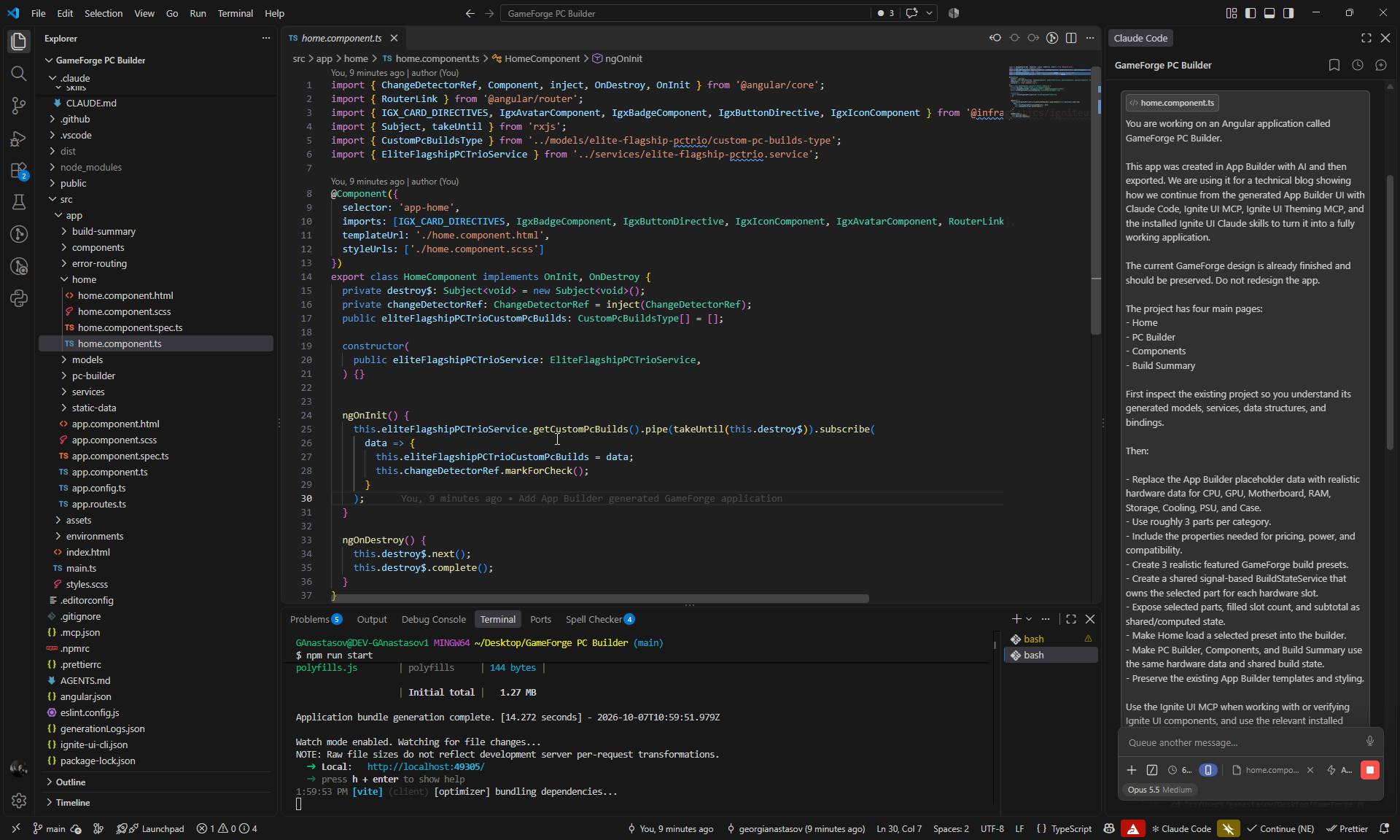
Build GameForge, an Angular PC builder app, in two iterations: generate it with App Builder AI, make it functional with Claude Code, Ignite UI MCP, and Ignite UI skills, then add an Admin Backoffice through a Git delta.
Georgi Anastasov 33min read
GameForge is a PC builder application: a storefront where customers configure a gaming or workstation PC, and a Backoffice where administrators manage the catalog, stock, prices, and orders. We built it in two iterations.
In the first iteration, App Builder AI generates the UI from a blank project. We export it to Angular, and Claude Code makes the generated pages work, with guidance from the Ignite UI MCP, the Ignite UI Theming MCP, and the Ignite UI skills.
In the second iteration, an Admin / Backoffice requirement arrives after the code has already moved on. We design it in App Builder again, inspect the Git delta, and have Claude integrate only what the evolved application needs.
What We Built
- Storefront: featured builds and presets, an eight-slot PC Builder, a 24-part catalog with search and filters, part replacement, live power, compatibility and pricing, saved configurations, and a Build Summary with checkout.
- Backoffice: admin login, dashboard metrics, order and status management, and catalog, stock, and price management that the storefront picks up immediately.
| Tool | Job in this workflow |
|---|---|
| App Builder AI | Generates and refines the UI from prompts, then exports it as an Angular project |
| Claude Code (Opus 5.5) | Implements data, state, and behavior in the exported project |
Ignite UI MCP (igniteui-cli) | Component documentation and API reference while Claude works |
Ignite UI Theming MCP (igniteui-theming) | Theme tokens for status colors and states |
| Ignite UI skills | Installed in the exported project and used |
Iteration 1: From a Blank App to a Working Storefront
Five App Builder prompts generate and refine the UI, then five Claude Code steps make it work.
Generate GameForge with App Builder AI
Start from a Blank Project with One Detailed Prompt
The project starts empty. The first prompt describes the whole app in order: its purpose, each page and its content, the data, the visual system, and a rule to keep the pages consistent.
Create a premium PC building application called GameForge with exactly three pages: Home, PC Builder, and Components.

Design GameForge as a modern high-end hardware configurator for people building custom gaming and workstation PCs. The experience should feel technical, precise and futuristic, but clean and restrained rather than full of RGB effects.

On the Home page, create a strong editorial-style hero with the GameForge brand, a bold "Build Your PC" call to action, a large premium gaming PC image, and a small set of performance highlights such as Gaming, Creator and Enthusiast. Below it, show several featured builds with large imagery, names, short specifications, prices and clear actions, followed by a compact "How It Works" section explaining the build process.

Make the PC Builder page the visual centerpiece of the application. Use a structured configurator layout with hardware categories for CPU, GPU, Motherboard, RAM, Storage, Cooling, Power Supply and Case. Show realistic sample selected parts with product imagery, model names, prices and the most important specifications. Include a visually distinct build summary area showing the selected components, a sample estimated total, a compatibility status and a clear "Review Build" action. Make selected and unselected component states easy to distinguish.

The Components page should feel like a premium hardware catalog rather than a generic product list. Include search and useful filters, and present realistic CPUs, GPUs, memory, storage and other parts using polished cards or a clean data-rich layout with product images, prices, brands, performance tiers and key specifications.

Use realistic generated hardware data throughout the app.

Use a dark graphite visual system with layered charcoal surfaces, crisp light typography and a restrained electric cyan or blue accent. Use subtle gradients, fine borders, compact technical labels, specification badges and large high-quality hardware imagery. Keep generous spacing and strong hierarchy. Avoid excessive neon, RGB gaming clichés, clutter and generic ecommerce styling.

Keep the navigation, typography, cards, buttons, spacing and visual language consistent across all three pages. The final result should feel like a polished product configurator that could realistically be used as the starting point for a working PC builder.Review the Generated Application
App Builder generated three pages, their data, and a theme:
- Home: a hero with tier highlights, featured builds with benchmark scores and prices, and a build guide. Build Your PC opens PC Builder.
- PC Builder: an eight-slot configurator with a build telemetry panel, compatibility badges and wattage per slot, and a Review Build dialog.
- Components: a hardware catalog with search, socket and performance tier filters, and a specification dialog.
- Data: three tables -
FeaturedBuild,BuilderSlot, andHardwareComponent- feeding the three pages. - Theme: “GameForge Graphite Precision”, with charcoal surfaces, the Space Grotesk typeface, cyan accents, and a shared top navigation bar.
Credits: 27 (27 of 100 used).
Refine the PC Builder Layout with a Focused Edit
The next prompts change one part of the app at a time instead of regenerating it. The PC Builder hardware cards stacked in a single column, so this prompt rearranges them and says what must not change:
Arrange the hardware cards inside this container into a two-column grid.

Keep every existing card and all of its current content unchanged. Use two equal-width columns with consistent horizontal and vertical spacing between the cards.

Do not change the Build Telemetry or Custom Build Invoice panels on the right, and do not change anything outside this selected container.
The selected container became a two-column grid. The cards kept their content, and more slots now fit on screen without scrolling.
Credits: 5 (32 of 100 used).
Add a Build Summary Page
Customers need a page to review a finished configuration before ordering:
Add a new Build Summary page that matches the existing GameForge application.

This page should present the completed PC configuration in a clean summary layout. Show the selected CPU, GPU, Motherboard, RAM, Storage, Cooling, Power Supply, and Case with names, prices, and short key specifications.

Include a pricing summary area with subtotal and estimated total, a compatibility status section, and clear actions such as "Back to Builder" and "Place Order".

Keep the same dark GameForge visual style, cyan accents, and clean technical look so the page feels like a natural part of the app.
App Builder added the page and a navigation button for it, and colored the new parts to match without recoloring anything else. The page has a build telemetry header, the hardware list, compatibility and clearance checks, and a pricing breakdown with Back to Builder and Place Order. Claude turns it into the live checkout in Step 5.
Credits: 13 (45 of 100 used).
Restyle the Whole Application
A two-sentence prompt moves the whole app from the dark theme to a light one:
Restyle the entire GameForge application with a light high-tech design.

Change the app from the current dark look to a clean bright visual style with white and soft silver surfaces, crisp dark text, subtle dividers, and refined cyan or electric blue accents.
App Builder created a “GameForge Cryo Tech” palette and applied it to containers, headers, borders, badges, and controls in the Master View and all four pages.
Credits: 7 (52 of 100 used).
Add a Global Footer in the Master View
Every page shares the Master View, so the footer goes there:
Add a footer to the master view below the navigation and page content so it appears on every page.

Create a clean high-tech footer for GameForge with the GameForge name, a short tagline, links to Home, PC Builder, Components, and Build Summary, plus a small support/contact area.

Add a bottom line with "© 2026 GameForge. All rights reserved."

Keep it minimal, elegant, and consistent with the current light premium design.
App Builder added the footer with the brand, navigation links, and support details. It reported the result as “Partly there”: the Direct Architecture Desk link is on the page but not wired to anything yet.
Credits: 11 (63 of 100 used).
App Builder Credits for Iteration 1
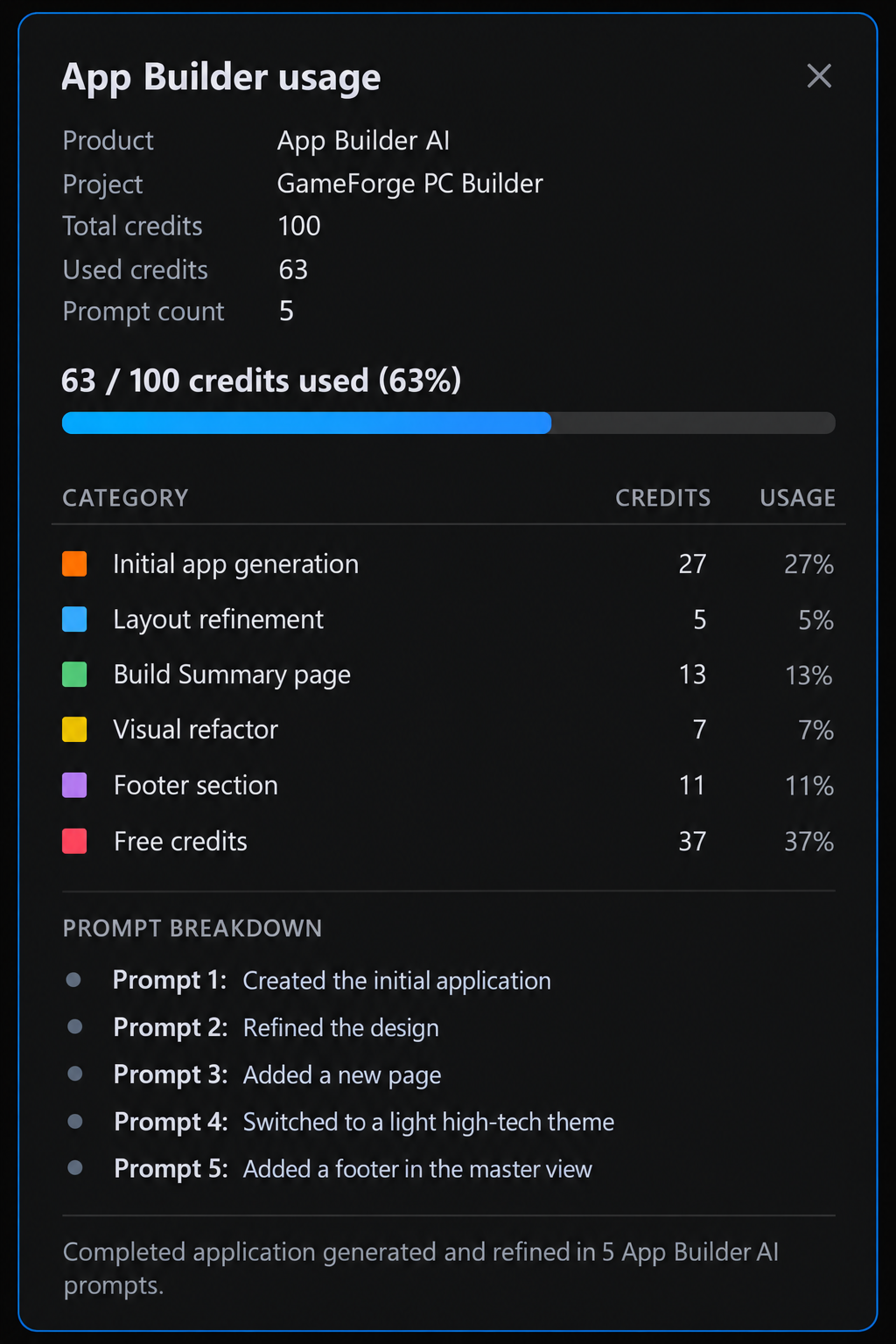
The five prompts used 63 of the 100 credits: 27 for the full generation and 5 to 13 for each change after it. Each kind of request has a fixed price, plus extra for generated pages, data sources, and images. The image below is an illustrative summary of these numbers, not a screen in App Builder.
GameForge now looks finished, but the data is sample data and most actions are placeholders. The next step moves it into code.
Export to Angular
App Builder exports the project as an Angular application. The handoff takes a couple of clicks.
Open the Project and Check the AI Setup
Unzip the exported project, open it in VS Code, and install the dependencies:
npm install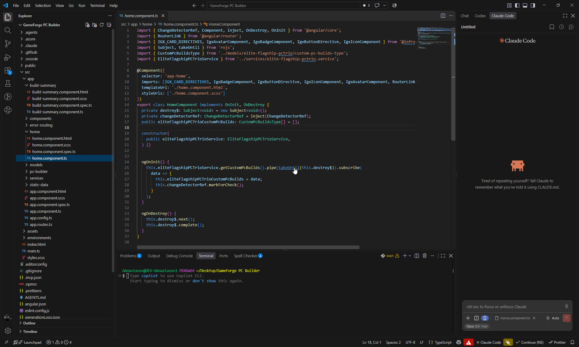
The export already includes the AI setup, so Claude can start without extra configuration:
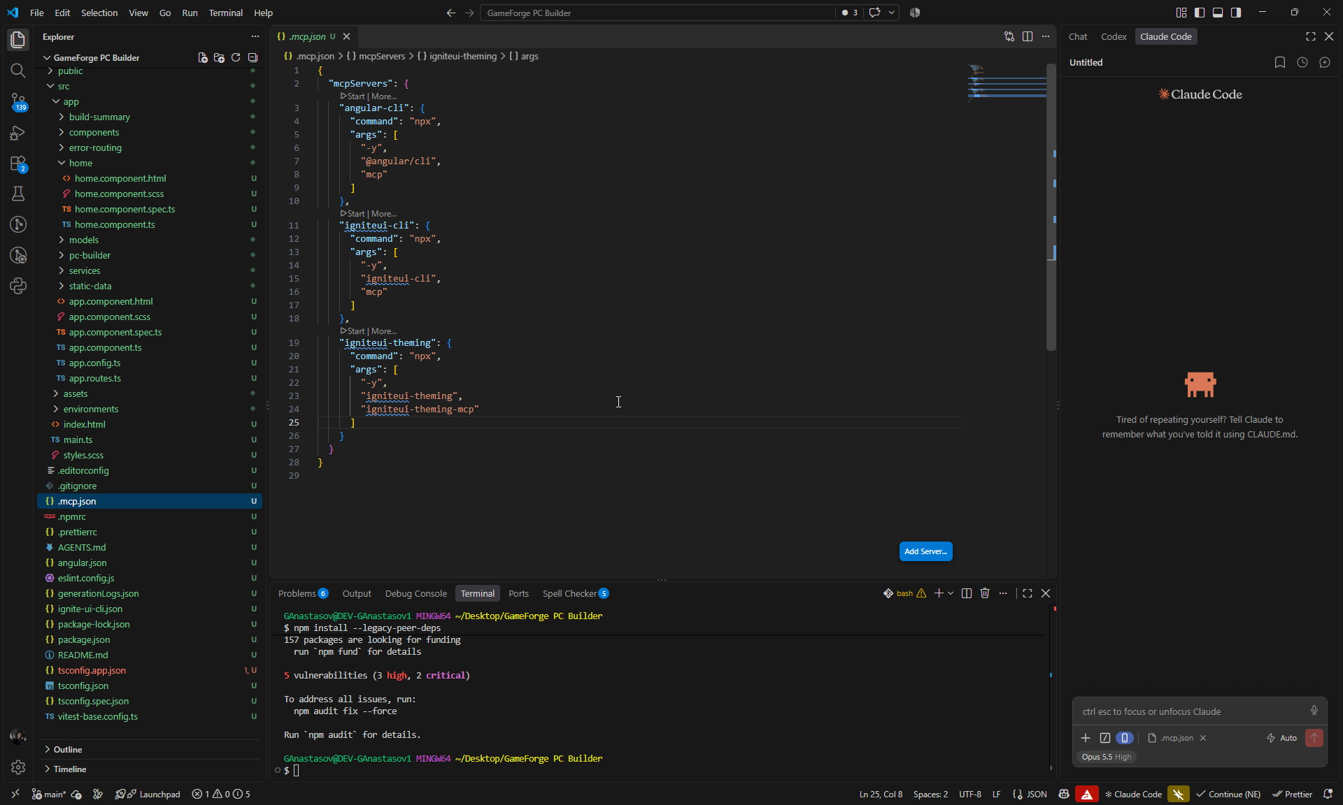
.mcp.jsonconfigures three MCP servers:angular-cli,igniteui-cli, andigniteui-theming. This workflow uses the two Ignite UI servers.- The Ignite UI skills are installed:
igniteui-angular-components,igniteui-angular-figma-to-app,igniteui-angular-generate-from-image-design,igniteui-angular-grids, andigniteui-angular-theming.
Make GameForge Functional with Claude Code and Ignite UI MCP
The App Builder design stays as it is. Claude Code builds the behavior behind it in five steps.
How Each Prompt Is Written and Verified
Every prompt tells Claude to keep the existing design, names the Ignite UI components involved, and points Claude to the Ignite UI MCP for their Angular APIs. After each step, Claude ran the build, lint, and unit tests, then drove the changed flows in Chromium with Playwright. Every step passed the build and lint with no console errors.
Step 1: Real Data and Shared Build State
The first prompt replaces the sample data with a realistic catalog and gives all four pages one shared build state:
You are working on an Angular application called GameForge PC Builder.

This app was created in App Builder with AI and then exported. We are using it for a technical blog showing how we continue from the generated App Builder UI with Claude Code, Ignite UI MCP, Ignite UI Theming MCP, and the installed Ignite UI Claude skills to turn it into a fully working application.

The current GameForge design is already finished and should be preserved. Do not redesign the app.

The project has four main pages:
- Home
- PC Builder
- Components
- Build Summary

First inspect the existing project so you understand its generated models, services, data structures, and bindings.

Then:

- Replace the App Builder placeholder data with realistic hardware data for CPU, GPU, Motherboard, RAM, Storage, Cooling, PSU, and Case.
- Use roughly 3 parts per category.
- Include the properties needed for pricing, power, and compatibility.
- Create 3 realistic featured GameForge build presets.
- Create a shared signal-based BuildStateService that owns the selected part for each hardware slot.
- Expose selected parts, filled slot count, and subtotal as shared/computed state.
- Make Home load a selected preset into the builder.
- Make PC Builder, Components, and Build Summary use the same hardware data and shared build state.
- Preserve the existing App Builder templates and styling.

Use the Ignite UI MCP when working with or verifying Ignite UI components, and use the relevant installed Ignite UI Claude skills where useful.
Claude added 24 parts, 3 for each of the 8 categories, each with a price, power draw, benchmark score, and the fields compatibility checks need, such as socket, memory type, form factor, GPU length, and case clearances. It created three presets, each priced as the sum of its parts:
| Preset | Tier | Price |
|---|---|---|
| Apex Titan | Flagship | $4,652 |
| Vanguard | Enthusiast | $2,542 |
| Raptor | Mainstream | $2,002 |
A new signal-based BuildStateService holds the part in each slot and exposes the selected parts, filled slot count, subtotal, and active preset. Home loads a preset into it, and the other three pages read from it.
The new models extend the generated ones, so the App Builder templates kept their bindings. Claude removed three generated services and their placeholder data once nothing used them, and moved the page components to OnPush, inject(), and signals.
The data also includes deliberate conflicts for Step 4 to catch: an Intel CPU and board next to the AMD ones, and a 168 mm Noctua NH-D15 G2 cooler that does not fit the 163 mm NZXT H6 Flow case.
Before binding the badge, linear progress bar, and Grid Lite, Claude checked their APIs through the Ignite UI MCP. It did not call the Theming MCP, because no styling changed.
Checks: 12 unit tests passing, 3 MCP calls.
Step 2: Working Catalog Filters
Next, the Components page gets working filters. The prompt names each Ignite UI component Claude should look up:
Make the existing Components page fully functional without changing its current design.

Use the Ignite UI MCP as the source of truth for the Angular APIs of the existing input, igx-select, igx-chip, dialog and snackbar components. Use the relevant installed Ignite UI Claude skills where useful.

Implement:

- Working search by part name, manufacturer and relevant specifications.
- Working Component Category filter.
- Working Performance Tier filter.
- Working Socket / Form Factor filter.
- Working Sort By.
- Make the existing quick-filter chips selectable and functional.
- Make Reset Filters clear all active filters and restore the full catalog.
- Update the visible component count automatically.
- Show a clear empty state when no parts match.

Use signals/computed state for the filtering and preserve the existing cards, layout, styling and hardware data.

Do not redesign the page or replace existing Ignite UI components unnecessarily.
Search now matches name, manufacturer, category, tier, socket or form factor, and specs. The igx-select dropdowns are bound to signals, the quick-filter chips combine (Processors + GPUs shows 6 parts), the “N Components Verified” count updates live and is announced to screen readers, and an empty state with its own Reset Filters button appears when nothing matches.
The Ignite UI MCP’s API reference returned older names for the chip event (onSelection) and the snackbar methods (show/hide). Claude checked them against the MCP chip guide and the installed typings, used selectedChanging, [selected], open(), and close() instead, and saved the finding to memory for later steps.
Claude also changed things the prompt did not ask for: the snackbar messages, the Review Rig button, the Benchmarks dialog, and Add to Custom Build. The changes were useful but overlapped with the next step, so the later prompts end with a sentence that limits the scope.
Checks: 18 unit tests passing, 5 MCP calls.
Step 3: Replace a Part from PC Builder
This prompt adds part replacement, so a customer can swap one part of the current build from PC Builder. Its last sentence is the scope limit:
Connect PC Builder and Components so users can replace a specific hardware part in their current build.

Preserve the existing design and the filtering functionality that already works.

Use the Ignite UI MCP when working with or verifying the relevant Angular component APIs, and use the relevant installed Ignite UI Claude skills where useful.

Implement:

- Make each existing Change Part action in PC Builder open `/components?slot=<slot>` for the correct hardware slot.
- On Components, read the `slot` query parameter and automatically filter the catalog to that hardware category.
- Clearly show which current part is being replaced.
- Mark the part that is already selected in the build.
- Make Select for Rig replace the part in that exact slot through BuildStateService.
- After replacement, show the existing confirmation snackbar with the old and new part names.
- Make Review Rig return to PC Builder, where the changed part and subtotal are immediately reflected.
- Make direct navigation to Components without a slot continue to behave as the normal full catalog.

Do not redesign anything and do not rework the existing filters, dialogs or snackbar behavior unless required for this flow.
Each Change Part button now opens Components filtered to its slot, for example /components?slot=gpu. A banner shows the part being replaced, the current part is marked “In Your Rig”, and Select for Rig swaps the part in that slot. The snackbar confirms it (“RTX 5080 replaced RTX 5090 in the GPU slot.”), and Review Rig returns to PC Builder, where the subtotal has dropped from $4,652 to $3,652. Opening Components without a slot still shows the full catalog.
The banner first used the theme’s lightest primary shade, but the caption text failed contrast on it. Claude switched to a tint mixed from the primary and surface colors.
Checks: 21 unit tests passing, 1 MCP call.
Step 4: Live Power, Compatibility, and Pricing
PC Builder still shows hard-coded telemetry. This prompt replaces it with live calculations and brings in the Ignite UI Theming MCP for the success, warning, and error states:
Make the existing PC Builder telemetry, compatibility and pricing fully functional using the shared BuildStateService.

Preserve the current GameForge design and existing components.

Use the Ignite UI MCP as the source of truth for the Angular APIs of the existing IgxBadge, IgxLinearProgressBar, dialog and snackbar components.

Use the Ignite UI Theming MCP with platform "angular" to inspect the correct theme tokens and visual states for success, warning and error. Use the relevant installed Ignite UI component and theming skills where useful.

Implement live calculations for:

- total estimated power draw;
- PSU capacity, utilisation and remaining headroom;
- parts subtotal and build total;
- CPU and motherboard socket compatibility;
- RAM and motherboard compatibility;
- motherboard and case form factor compatibility;
- GPU length and case clearance;
- cooling and case compatibility;
- PSU capacity;
- whether all required hardware slots are populated.

Replace the existing hard-coded PC Builder values with these calculations.

Make the existing badges and progress bar react to the current build with clear success, warning and failure states based on the Ignite UI MCP and Theming MCP guidance.

Update the existing Review Build dialog so it shows the real 8 selected parts, current pricing, power information and any compatibility issues.

Make the existing assembly/testing options affect the calculated total.

Make Save Configuration actually persist the current build and restore it after a page reload.

Keep the implementation focused on the existing UI and do not redesign the page.
PC Builder now calculates these values from the current build:
- Power: the Apex Titan preset draws 825 W on a 1200 W PSU, which leaves “375W (31% buffer)”. Up to 80% load is success, 80-100% is warning, and over 100% is error, set through the progress bar’s own states.
- Compatibility: eight checks cover empty slots, CPU socket, RAM type, motherboard size, GPU length, cooler fit and mounting, and PSU capacity. A check that depends on an empty slot shows as pending instead of failing.
- Pricing: the subtotal, assembly tier, and thermal tuning option drive the estimated total.
- Review Build: the dialog lists the real parts, power, prices, and issues. Proceed to Checkout stays disabled while there are conflicts or empty slots.
- Save Configuration: the build is stored in the browser and restored on reload. Saved entries that no longer match the catalog are ignored.
The warning and error colors use the theme’s warn and error tokens, found through the Theming MCP, and pass WCAG AA contrast on the panel. The option prices (Precision Stress-Testing $49, Extreme Benchmarking & Burn-in $149, Precision Thermal Tuning $79) are demo values Claude chose from the existing copy.
Checks: 36 unit tests passing, 7 MCP calls (2 Ignite UI MCP, 5 Theming MCP).
Step 5: Build Summary and Checkout
Build Summary is the last page with placeholder values. This prompt turns it into a checkout and replaces the raw Grid Lite web component with the Angular one:
Make the existing Build Summary page fully functional and synchronize it with the shared GameForge build state.

Preserve the current design and reuse the existing Ignite UI components.

Use the Ignite UI MCP as the source of truth for the Angular APIs of:
- IgxGridLiteComponent
- grid data binding, columns, sorting, filtering and cell templates
- IgxBadge
- IgxDialog
- IgxSelect
- IgxSnackbar

Use the igniteui-angular-grids and igniteui-angular-components skills where useful. Use the Ignite UI Theming MCP with platform "angular" only if status styling needs theme/token work.

Implement:

- Make Build Summary show the exact same selected parts, slot count, power, compatibility and pricing as PC Builder.
- Remove the remaining hard-coded summary values.
- Replace the current raw Grid Lite web component with the Angular IgxGridLiteComponent.
- Populate the grid from the real compatibility checks and use clear columns with pass/warning/fail status badges.
- Keep sorting and filtering working.
- Make shipping and payment selections functional.
- Calculate shipping, tax, payment discount and final total live.
- Use the existing checkout dialog with proper validation.
- Prevent ordering when the build is incomplete or has compatibility failures.
- Make Confirm & Place Order create a simple order id/snapshot, close the dialog, show the existing snackbar, and display an Order Confirmed state.
- Add a Start New Build action that resets the current build.
- Make Proceed to Checkout from PC Builder open Build Summary with the same current build.

Do not redesign the page or replace existing components unnecessarily.
Build Summary now shows the same build as PC Builder. For Apex Titan, PC Builder’s $4,701 equals the summary’s $4,652 in hardware plus $49 for testing.
- Compatibility grid: the
igc-grid-liteweb component is replaced with the AngularIgxGridLiteComponent, which shows the 8 checks with anigx-badgestatus column. Sorting and filtering work on every column. - Checkout: shipping and payment use the existing
igx-selectcomponents in a reactive form. Shipping, a wire-transfer discount, tax, and the total update live (demo rates). - Ordering: Place Order and Confirm are disabled for an incomplete build or a compatibility failure, with the reason shown. Confirm & Place Order creates an order ID such as
GF-MUY3L5KH-2QO4and an Order Confirmed state, and Start New Build clears the build.
The igniteui-angular-grids skill guided the Grid Lite setup, imports, cell templates, and Angular wrapper. The new pricing rules reproduce the original App Builder invoice total of $3,086.37 exactly. A unit test also caught a one-cent rounding error: 1.5% of $1,079 came out as $16.18 instead of $16.19.
Checks: 45 unit tests passing, 4 MCP calls.
Iteration 1 in Numbers
This is where the workflow starts to pay off. Five App Builder prompts and 63 credits took GameForge from a blank project to a polished four-page design. Five focused Claude Code steps then turned the design into a working storefront: a real catalog, shared build state, filtering, part replacement, live power and compatibility checks, pricing, saved configurations, and checkout. By the end, 45 unit tests pass, and every step’s changes were checked in the browser.
Across the five steps, Claude made 20 MCP calls (15 to the Ignite UI MCP, 5 to the Theming MCP) and also used the Ignite UI skills. The calls covered component APIs, Grid Lite, the badges and progress bar that react to the build state, and the theme tokens behind the status colors. Each answer reached the agent while it was writing the code that needed it, so component knowledge turned directly into working features.
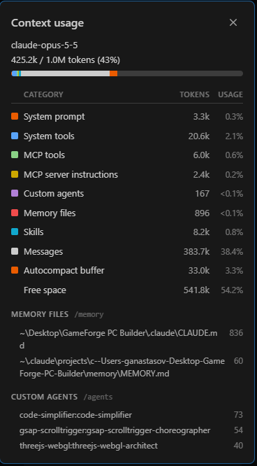
Context window at the end of the session (Claude Code, Opus 5.5, 1M tokens):
| Category | Tokens | Share |
|---|---|---|
| Context used | 425.2k | 43% |
| Messages | 383.7k | 38.4% |
| MCP tools | 6.0k | 0.6% |
| MCP server instructions | 2.4k | 0.2% |
| Skills | 8.2k | 0.8% |
| Free | 541.8k | 54.2% |
That help took very little room: MCP tools and server instructions used 8.4k tokens, under 1% of the window. The table is a snapshot of the context window, not the total tokens the session consumed.
Iteration 1 ends with a complete, working Angular application. Ten prompts took GameForge from an idea to a tested storefront: five in App Builder for the UI, and five in Claude Code with Ignite UI MCP for the behavior.
Iteration 2: Adding an Admin Backoffice
At the end of Iteration 1, GameForge works: customers can configure a build, check compatibility, and place an order. Real projects rarely stop at that point. New requirements arrive after the first version is done, designs change, and new functionality has to fit into code that has already moved well beyond what was first generated.
We simulate that situation on purpose. The new requirement is an Admin / Backoffice experience for managing components, prices, stock and availability, and customer orders.
We return to App Builder to design the new screens, then use only the App Builder changes as input for the Angular application Claude has already built. Claude Code, with the Ignite UI MCP servers and skills, integrates the new functionality into the existing architecture without overwriting the work from Iteration 1.
Prepare for the Next Iteration
Before any Admin work starts, both versions of the project go to GitHub.
Publish the Claude Project to GitHub
The Angular project, with all the work from Iteration 1, goes to its own repository. It remains the main project and the source of truth.
Publish the App Builder Baseline
The App Builder project goes to a separate repository before any new changes are made in App Builder.
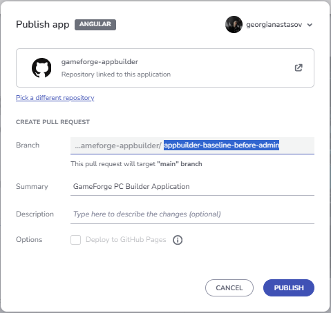
App Builder publishes it as a Pull Request into main (Pull Request #1 here), and that Pull Request is merged before any Admin work starts. With the baseline in main, anything App Builder generates for the Admin requirement shows up as a clean diff against it.
A New Requirement: Admin Backoffice
Administrators need an area to manage the catalog, stock, prices, and customer orders. In App Builder, that means an Admin entry in the navigation, an Admin Login page, and a Backoffice page. The Angular application has changed a lot since the export, so the updated App Builder project is not merged into it. Instead:
- Add the Admin pages in the App Builder project.
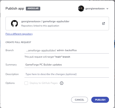
- Publish the update to a new branch with a Pull Request.
- Compare the branch with the baseline on GitHub to see the exact delta.
- In the main project, fetch both App Builder states and inspect the delta with Git.
- Let Claude Code integrate only the Admin-related changes, without overwriting existing functionality.
- Connect the new Admin UI to the existing data, orders, and state.
Build the Admin Experience in App Builder
The second iteration starts with 37 credits left and uses three prompts.
Add the Admin Entry to the Navigation
Add a new Admin entry at the far right of the existing top navigation bar.

Use a clear admin-style icon together with the label "Admin".

Keep it visually consistent with the current GameForge navigation and overall light high-tech design.

When clicked, it should navigate to a new page called "Admin Login".
App Builder added an Admin button with an admin icon at the far right of the Master View navigation. Because it is in the shared header, it appears on every page and starts the Backoffice flow.
Credits: 5 (68 of 100 used).
Generate the Admin Login Page
Add a new page called "Admin Login".

Create a clean, modern login page for the GameForge backoffice that matches the existing light high-tech design.

Use the same container-based layout approach as the rest of the application so the page feels fully consistent with the existing structure, spacing, and alignment.

Place the login content inside a centered main container with a focused inner login panel.

Include:
- GameForge / Backoffice branding
- "Admin Login" title
- short subtitle explaining that this area is for administrators
- Email field
- Password field
- prominent Sign In button
- secondary Back to Store action

Keep the page simple, polished, and visually consistent with the rest of the GameForge application.
App Builder created the Admin Login page with a centered authentication layout in the GameForge light theme, including the login fields and a Back to Store action, and connected the Admin entry to it.
Credits: 11 (79 of 100 used).
Generate the Admin Backoffice Page
Add a new page called "Admin Backoffice".

Create a polished, modern administration dashboard for managing the entire GameForge application.

The page should feel like a real backoffice product, not just a regular content page. It should be easy to scan, easy to operate, and visually consistent with the existing GameForge light high-tech design.

Use the same container-based layout approach, spacing, cards, typography, borders, and overall visual language as the rest of the application.

Structure the page around one clear main admin workspace with these areas:

1. Admin Overview
Create a compact dashboard header and summary cards for:
- Total Orders
- Pending Orders
- Revenue
- Low Stock Components

2. Orders Management
Add a clear, data-rich management section where administrators can quickly review and manage customer orders.

Show:
- Order ID
- Customer
- Date
- Total
- Payment
- Status
- Actions

Use clear status badges and make each order easy to review or update.

3. Components Management
Add a dedicated hardware management section for maintaining the PC component catalog.

Show:
- Component image
- Component name
- Category
- Price
- Stock
- Availability
- Actions

Include prominent actions for:
- Add Component
- Edit Component
- Delete Component
- Update price
- Update stock
- Change availability

Make the page feel operational and practical, with strong hierarchy, clear actions, and well-separated management areas.

The final result should look like a professional GameForge admin dashboard from which an administrator could manage the store, hardware catalog, inventory, and customer orders.
App Builder created the Backoffice dashboard with overview metrics, Orders Management, Components Management, and inventory controls, in the same visual style as the rest of the app. The later integration builds on this structure.
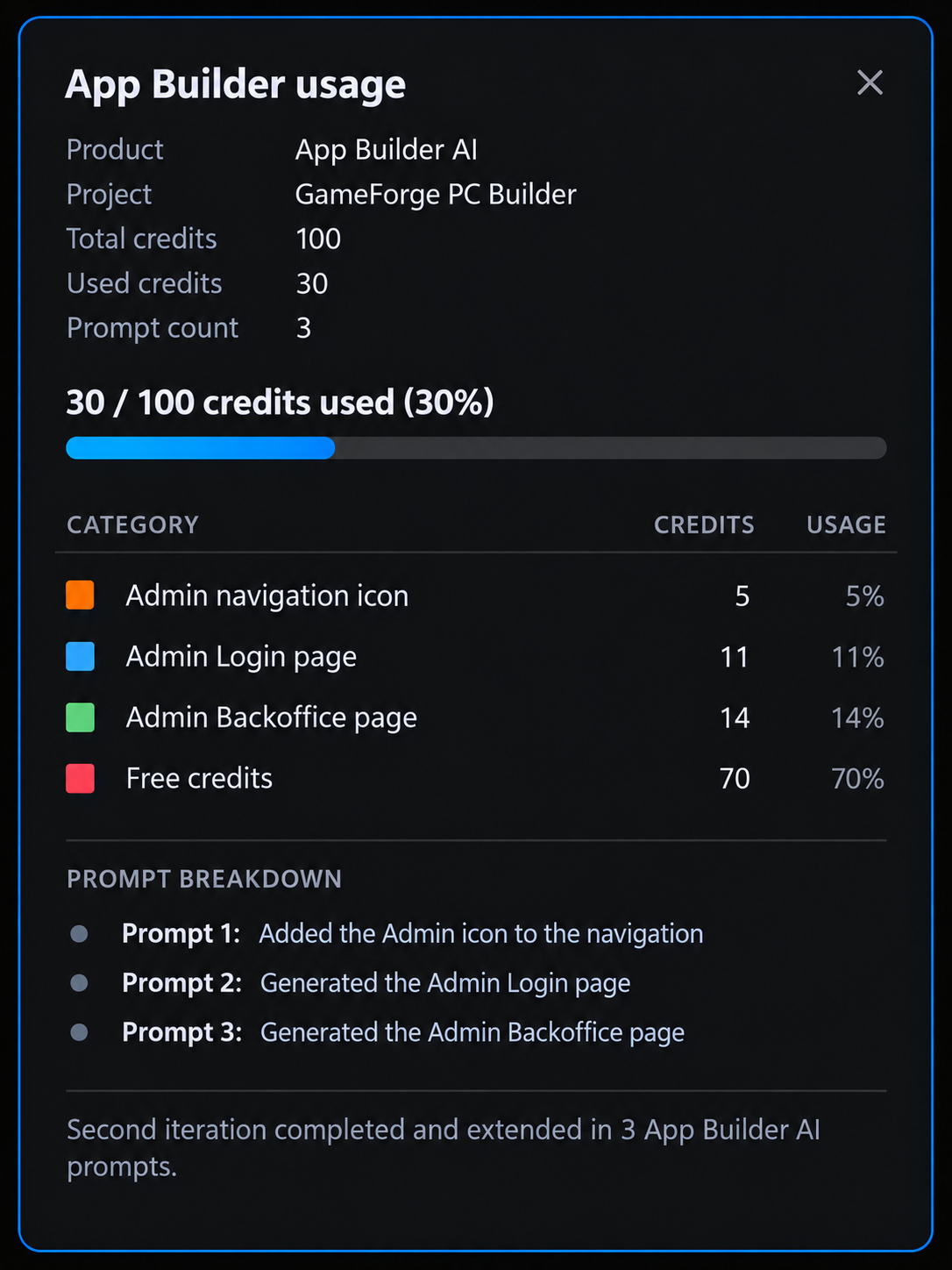
Credits: 14 (93 of 100 used). The Admin experience used 30 of the 37 remaining credits.
Publish the Update to a Branch and Compare It on GitHub
The updated App Builder project goes to a separate branch with a Pull Request. GitHub compares it with the baseline and shows exactly what App Builder added or changed for the Admin requirement.
Bring the Admin Delta into the Main Project
The two projects stay in separate repositories, and only the useful parts of the delta come across.
Inspect the Delta with Git
In the main project, these commands:
- Create an integration branch,
ganastasov/admin-backoffice-integration, from an up-to-datemain. - Add the App Builder repository as a second remote,
appbuilder. - Fetch the baseline (
appbuilder/main) and the Admin Pull Request (#2) as a local branch,appbuilder-admin. - Show which files changed between the two App Builder states, with a per-file summary of the changes.
git checkout main
git pull origin main
git checkout -b ganastasov/admin-backoffice-integration

git remote add appbuilder https://github.com/georgianastasov/gameforge-appbuilder.git
git remote -v

git fetch appbuilder main
git fetch appbuilder pull/2/head:appbuilder-admin

git diff --name-status appbuilder/main..appbuilder-admin
git diff --stat appbuilder/main..appbuilder-admin
These commands were run while the Admin Pull Request (#2) was still open. It has since been merged, so appbuilder/main now includes the Admin changes and no longer serves as the baseline. To repeat the comparison after the merge, fetch the baseline Pull Request (pull/1/head) and diff against it instead.
Nothing from App Builder is merged into the main project. A merge would bring generated code back over the evolved application, including the services removed in Step 1. Inspecting the delta keeps the main project as the source of truth.
Integrate the Admin Experience
One implementation prompt settles the open decisions and asks for the integration:
The analysis looks good. Proceed with the integration.

Use these decisions:

- Add Component should support the full hardware data required by the existing compatibility system. Make the additional specification fields category-aware where appropriate so an admin is not presented with irrelevant fields.
- Add a Customer Name field to the existing checkout flow so newly placed orders can display a real customer name in the Admin Backoffice.
- Use one simple demo admin credential for this application. This is demo client-side authentication, not production security.
- Inventory must affect the storefront. Admin stock and availability changes should be reflected in the customer-facing Components / PC Builder experience.

Implement the Admin experience using the current application as the source of truth.

Use the App Builder delta as the visual/design source for:
- Admin navigation entry;
- Admin Login;
- Admin Backoffice layout and styling.

Do not copy the generated placeholder services, static data, or duplicate hardware model architecture.

Implement the integration properly using the existing application architecture and conventions.

The final flow should support:

- Admin login and guarded Backoffice access.
- Admin logout/session handling.
- Real overview KPIs derived from application state.
- Order history containing seeded demo orders and newly placed customer orders.
- Customer name, payment status, and fulfillment status.
- Admin order status management.
- Inventory management per hardware part.
- Stock and availability updates.
- Hardware price editing.
- Adding new hardware components with the specifications required by the compatibility system.
- Discontinuing/removing components safely without breaking existing presets or saved builds.
- Admin catalog changes reflected in the customer storefront.
- Admin inventory changes reflected in the customer storefront.
- Existing PC Builder, compatibility, pricing, saved builds, Build Summary, and checkout behaviour must continue to work.

Follow the current project conventions:
- signals where appropriate;
- `inject()`;
- `ChangeDetectionStrategy.OnPush`;
- reactive forms;
- lazy-loaded admin routes;
- existing Ignite UI patterns and components.

Use Ignite UI MCP and the installed Ignite UI skills when they are useful for component APIs, grids, dialogs, forms, exporters, or other Ignite UI implementation details. Validate any MCP information against the installed project version when necessary.

Preserve the visual design generated by App Builder as closely as practical while adapting its behaviour to the current architecture.

Add or update tests for the new functionality and run the existing test suite, build, and lint checks.

After implementation, report:
- files added or changed;
- how the App Builder delta was adapted;
- how the new Admin state connects to the existing storefront;
- tests/build/lint results;
- Ignite UI MCP or skill usage during this implementation.
Claude took the HTML, SCSS, layout, icons, and visual structure from App Builder. It did not copy the generated placeholder services, duplicate models, or static data, and rewrote the generated logic in the project’s conventions. Besides login, the dashboard, and order management, the integration adds category-specific specification fields for new components, persistent order history, and Discontinue / Restore instead of deleting parts.
Connect the Storefront and the Backoffice
The Backoffice and the storefront share the same state, so changes flow both ways:
- Price edits update PC Builder, Build Summary, Home preset prices, and Components.
- New components appear in the storefront immediately.
- Discontinued components are hidden from new selections but stay in existing builds, presets, and past orders.
- Stock and availability control what customers can select, and an unavailable part in the build blocks checkout and names the part to replace.
- Checkout now asks for a Customer Name, reduces inventory, and creates an order in the Backoffice.
Verify the Full Flow
The full scenario was tested in Chromium:
- Opening Backoffice redirects to Admin Login.
- Invalid credentials show an error.
- The admin signs in.
- A new RTX 5070 Ti is added.
- The RTX 5090 price is changed to $1,899 and its stock is set to 0.
- The storefront immediately shows the new price and “Out of Stock”.
- Build Summary blocks checkout because the selected RTX 5090 is unavailable.
- The component is restocked.
- A customer named “Jordan Lee” completes checkout.
- The new order appears at the top of the Admin Backoffice order grid.
- Sign Out returns to Home.
The flow ran with no console errors, lint is clean, and the production build succeeds.
Iteration 2 in Numbers
The second iteration shows that the workflow keeps working after the project has moved on. Three more App Builder prompts and 30 credits designed a complete Admin / Backoffice experience: a navigation entry, a login page, and a dashboard for orders, components, and inventory. The Git delta then brought that design into an application that had changed a lot since the export, without overwriting any of the work from Iteration 1.
| Metric | Iteration 2 |
|---|---|
| App Builder credits | 30 (93 of 100 across both iterations) |
| Unit tests | 45 before, 105 / 105 after (+60) |
| Ignite UI MCP calls | 5 |
| Ignite UI Theming MCP calls | 2 |
| Total Ignite UI MCP calls | 7 |
| Skill used | igniteui-angular-grids |
Claude Code, the Ignite UI MCP servers, and the igniteui-angular-grids skill turned the generated Admin pages into working features connected to the rest of the app. The grid skill guided the Admin igx-grid setup, imports, igxCell templates, row selection, Excel-style filtering, CSV export, and sizing, and the Theming MCP supplied the design tokens. Forms and dialogs needed no direct MCP help, and accessibility was checked through browser and axe testing. With the Ignite UI patterns already in place from Iteration 1, seven MCP calls were enough.
The test suite grew from 45 to 105 passing tests. Price, stock, and catalog changes made in the Backoffice reach the storefront immediately, and customer orders flow back into the Backoffice.
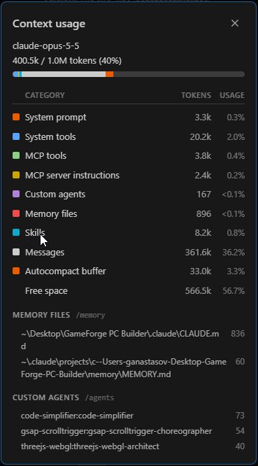
At the end of the Admin session, the context window held 400.5k of 1M tokens (40%). MCP tools and server instructions took 6.2k tokens (about 0.6%), and skills 8.2k (0.8%).
Three App Builder prompts and one Claude implementation prompt added a working Backoffice to a working storefront. The workflow is as useful for growing an application when new requirements arrive as it is for creating one.
As in Iteration 1, the App Builder credits image below is an illustrative summary, not a screen in App Builder.
Why App Builder and Ignite UI MCP Work So Well Together
App Builder AI and Ignite UI MCP handle different halves of the same job, and GameForge shows how well they fit together.
App Builder takes care of the expensive starting phase. From a blank project, five prompts produced a structured application with pages, layouts, navigation, Ignite UI components, data shapes, styling, and a consistent experience across every view. The coding agent never had to invent that structure from scratch. It started from a real foundation. And because App Builder exports a standard Angular project and publishes to GitHub, the work continues as a regular code project in your usual development workflow, instead of staying inside the visual tool.
Ignite UI MCP takes over at the handoff. Claude starts with a working codebase, and the MCP servers give it direct access to the Ignite UI documentation, component APIs, and theme tokens it needs. The agent can spend its context on data, state, business rules, integration, and iteration instead of rebuilding the UI. When it needed the right chip event, the Grid Lite setup, or the warn and error tokens, it looked them up instead of guessing. The MCP tools and server instructions stayed under 1% of the context window in both sessions.
The second iteration is the strongest proof. After the codebase had moved far beyond the original export, App Builder designed a complete Admin / Backoffice area, Git isolated exactly what changed, and Claude integrated it without breaking the storefront. Across both iterations, GameForge took 8 App Builder prompts and 93 of 100 credits. It ends as a complete storefront and Backoffice with live pricing, compatibility checks, inventory, checkout, and orders that flow between the Admin and the storefront, all backed by 105 passing tests.
App Builder gets you to a strong application foundation quickly. Ignite UI MCP then lets the coding agent spend its intelligence where it adds the most value: turning that foundation into a real product and continuing to evolve it.
This is more than a fast way to prototype. It is a practical path from idea to design, to code, to a working application, and through the iterations that follow.