
App Builder AIから、Ignite UI MCPで動作するAngularアプリへ
AngularのPCビルダーアプリ「GameForge」を2回のイテレーションで構築します。App Builder AIで生成し、Claude Code、Ignite UI MCP、Ignite UI skillsで機能を実装したうえで、Gitの差分を通じてAdmin Backofficeを追加します。
Georgi Anastasov 16min read
GameForgeはPCビルダーアプリケーションです。顧客がゲーミングPCやワークステーションPCを構成するストアフロントと、管理者がカタログ、在庫、価格、注文を管理するBackofficeで構成されています。このアプリを2回のイテレーションで構築しました。
最初のイテレーションでは、App Builder AIが空のプロジェクトからUIを生成します。それをAngularにエクスポートし、Claude CodeがIgnite UI MCP、Ignite UI Theming MCP、Ignite UI skillsのガイダンスを受けながら、生成されたページを動作させます。
2回目のイテレーションでは、コードがすでに大きく進化した後に、Admin / Backofficeの要件が追加されます。それを再びApp Builderでデザインし、Gitの差分を確認したうえで、進化したアプリケーションに必要な部分だけをClaudeに統合させます。
構築したもの
- ストアフロント: 注目のビルドとプリセット、8スロットのPC Builder、検索とフィルターを備えた24パーツのカタログ、パーツの交換、電力・互換性・価格のリアルタイム計算、構成の保存、そしてチェックアウト付きのBuild Summary。
- Backoffice: 管理者ログイン、ダッシュボードの指標、注文とステータスの管理、そしてストアフロントに即座に反映されるカタログ、在庫、価格の管理。
| ツール | このワークフローでの役割 |
|---|---|
| App Builder AI | プロンプトからUIを生成・改善し、Angularプロジェクトとしてエクスポート |
| Claude Code (Opus 5.5) | エクスポートしたプロジェクトにデータ、状態、動作を実装 |
Ignite UI MCP (igniteui-cli) | Claudeの作業中にコンポーネントのドキュメントとAPIリファレンスを提供 |
Ignite UI Theming MCP (igniteui-theming) | ステータスカラーと状態のテーマトークンを提供 |
| Ignite UI skills | エクスポートしたプロジェクトにインストールされ、使用される |
イテレーション1:空のアプリから動作するストアフロントへ
5つのApp BuilderプロンプトでUIを生成・改善し、その後Claude Codeの5つのステップで動作させます。
App Builder AIでGameForgeを生成する
1つの詳細なプロンプトで空のプロジェクトから始める
プロジェクトは空の状態から始まります。最初のプロンプトでは、アプリ全体を順番に説明します。目的、各ページとそのコンテンツ、データ、ビジュアルシステム、そしてページ間の一貫性を保つためのルールです。
Create a premium PC building application called GameForge with exactly three pages: Home, PC Builder, and Components.

Design GameForge as a modern high-end hardware configurator for people building custom gaming and workstation PCs. The experience should feel technical, precise and futuristic, but clean and restrained rather than full of RGB effects.

On the Home page, create a strong editorial-style hero with the GameForge brand, a bold "Build Your PC" call to action, a large premium gaming PC image, and a small set of performance highlights such as Gaming, Creator and Enthusiast. Below it, show several featured builds with large imagery, names, short specifications, prices and clear actions, followed by a compact "How It Works" section explaining the build process.

Make the PC Builder page the visual centerpiece of the application. Use a structured configurator layout with hardware categories for CPU, GPU, Motherboard, RAM, Storage, Cooling, Power Supply and Case. Show realistic sample selected parts with product imagery, model names, prices and the most important specifications. Include a visually distinct build summary area showing the selected components, a sample estimated total, a compatibility status and a clear "Review Build" action. Make selected and unselected component states easy to distinguish.

The Components page should feel like a premium hardware catalog rather than a generic product list. Include search and useful filters, and present realistic CPUs, GPUs, memory, storage and other parts using polished cards or a clean data-rich layout with product images, prices, brands, performance tiers and key specifications.

Use realistic generated hardware data throughout the app.

Use a dark graphite visual system with layered charcoal surfaces, crisp light typography and a restrained electric cyan or blue accent. Use subtle gradients, fine borders, compact technical labels, specification badges and large high-quality hardware imagery. Keep generous spacing and strong hierarchy. Avoid excessive neon, RGB gaming clichés, clutter and generic ecommerce styling.

Keep the navigation, typography, cards, buttons, spacing and visual language consistent across all three pages. The final result should feel like a polished product configurator that could realistically be used as the starting point for a working PC builder.生成されたアプリケーションを確認する
App Builderは、3つのページ、そのデータ、テーマを生成しました。
- Home: ティアのハイライトを含むヒーロー、ベンチマークスコアと価格を表示する注目のビルド、ビルドガイド。Build Your PCでPC Builderが開きます。
- PC Builder: ビルドテレメトリーパネル、互換性バッジとスロットごとのワット数、Review Buildダイアログを備えた8スロットのコンフィギュレーター。
- Components: 検索、ソケットとパフォーマンスティアのフィルター、仕様ダイアログを備えたハードウェアカタログ。
- データ: 3つのページにデータを提供する3つのテーブル -
FeaturedBuild、BuilderSlot、HardwareComponent。 - テーマ: “GameForge Graphite Precision”。チャコールのサーフェス、Space Grotesk書体、シアンのアクセント、共有のトップナビゲーションバーで構成されています。
クレジット: 27(100のうち27を使用)。
フォーカスした編集でPC Builderのレイアウトを改善する
次のプロンプトでは、アプリを再生成するのではなく、一度に1つの部分を変更します。PC Builderのハードウェアカードが1列に積み重なっていたため、このプロンプトでカードを並べ替え、変更してはならない部分を指定します。
Arrange the hardware cards inside this container into a two-column grid.

Keep every existing card and all of its current content unchanged. Use two equal-width columns with consistent horizontal and vertical spacing between the cards.

Do not change the Build Telemetry or Custom Build Invoice panels on the right, and do not change anything outside this selected container.
選択したコンテナーは2列のグリッドになりました。カードの内容はそのまま維持され、スクロールせずに画面に収まるスロットが増えました。
クレジット: 5(100のうち32を使用)。
Build Summaryページを追加する
顧客には、注文前に完成した構成を確認するページが必要です。
Add a new Build Summary page that matches the existing GameForge application.

This page should present the completed PC configuration in a clean summary layout. Show the selected CPU, GPU, Motherboard, RAM, Storage, Cooling, Power Supply, and Case with names, prices, and short key specifications.

Include a pricing summary area with subtotal and estimated total, a compatibility status section, and clear actions such as "Back to Builder" and "Place Order".

Keep the same dark GameForge visual style, cyan accents, and clean technical look so the page feels like a natural part of the app.
App Builderはページとそのナビゲーションボタンを追加し、他の部分の配色を変えることなく、新しい部分を既存のデザインに合わせて配色しました。ページには、ビルドテレメトリーのヘッダー、ハードウェアの一覧、互換性とクリアランスのチェック、そしてBack to BuilderとPlace Orderを含む価格の内訳があります。Claudeはステップ5で、このページを実際に動作するチェックアウトに仕上げます。
クレジット: 13(100のうち45を使用)。
アプリケーション全体のスタイルを変更する
2文のプロンプトで、アプリ全体をダークテーマからライトテーマに切り替えます。
Restyle the entire GameForge application with a light high-tech design.

Change the app from the current dark look to a clean bright visual style with white and soft silver surfaces, crisp dark text, subtle dividers, and refined cyan or electric blue accents.
App Builderは”GameForge Cryo Tech”パレットを作成し、Master Viewと4つのすべてのページのコンテナー、ヘッダー、ボーダー、バッジ、コントロールに適用しました。
クレジット: 7(100のうち52を使用)。
Master Viewにグローバルフッターを追加する
すべてのページはMaster Viewを共有しているため、フッターはそこに追加します。
Add a footer to the master view below the navigation and page content so it appears on every page.

Create a clean high-tech footer for GameForge with the GameForge name, a short tagline, links to Home, PC Builder, Components, and Build Summary, plus a small support/contact area.

Add a bottom line with "© 2026 GameForge. All rights reserved."

Keep it minimal, elegant, and consistent with the current light premium design.
App Builderは、ブランド、ナビゲーションリンク、サポート情報を含むフッターを追加しました。結果は”Partly there”と報告されました。Direct Architecture Deskリンクはページ上にありますが、まだ何にも接続されていないためです。
クレジット: 11(100のうち63を使用)。
イテレーション1のApp Builderクレジット
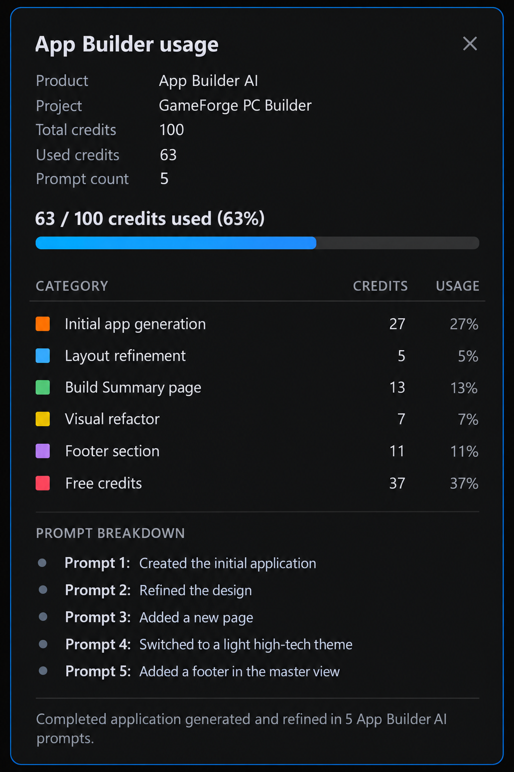
5つのプロンプトで、100クレジットのうち63を使用しました。アプリ全体の生成に27、その後の各変更に5~13です。リクエストの種類ごとに固定料金があり、生成されるページ、データソース、画像に応じて追加されます。下の画像はこれらの数値をまとめたイメージ図で、App Builderの実際の画面ではありません。
GameForgeは完成したように見えますが、データはサンプルデータで、ほとんどのアクションはプレースホルダーです。次のステップでは、これをコードに移行します。
Angularにエクスポートする
App Builderは、プロジェクトをAngularアプリケーションとしてエクスポートします。引き渡しは数回のクリックで完了します。
プロジェクトを開いてAIのセットアップを確認する
エクスポートしたプロジェクトを解凍し、VS Codeで開いて、依存関係をインストールします。
npm install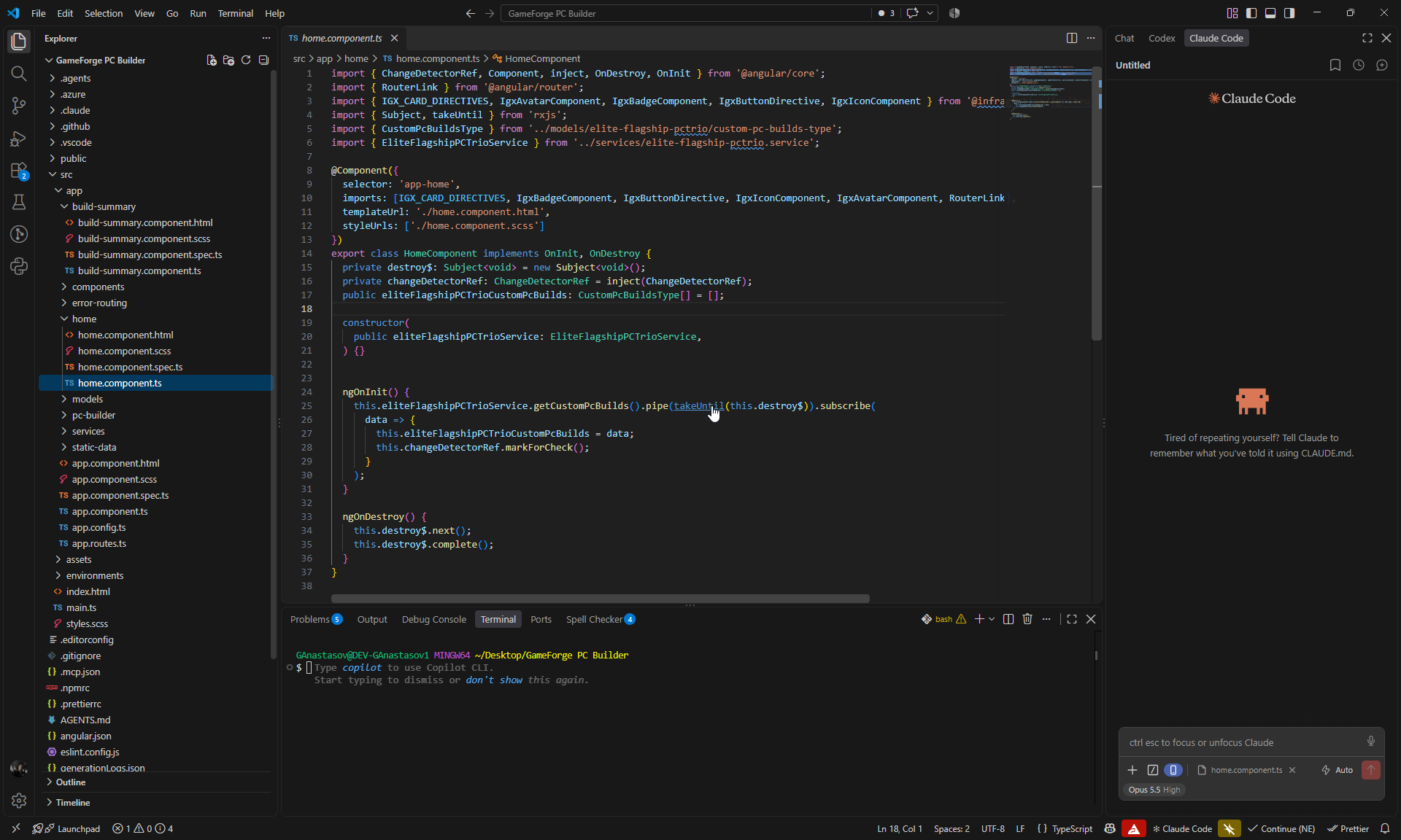
エクスポートにはAIのセットアップがすでに含まれているため、Claudeは追加の設定なしで作業を開始できます。
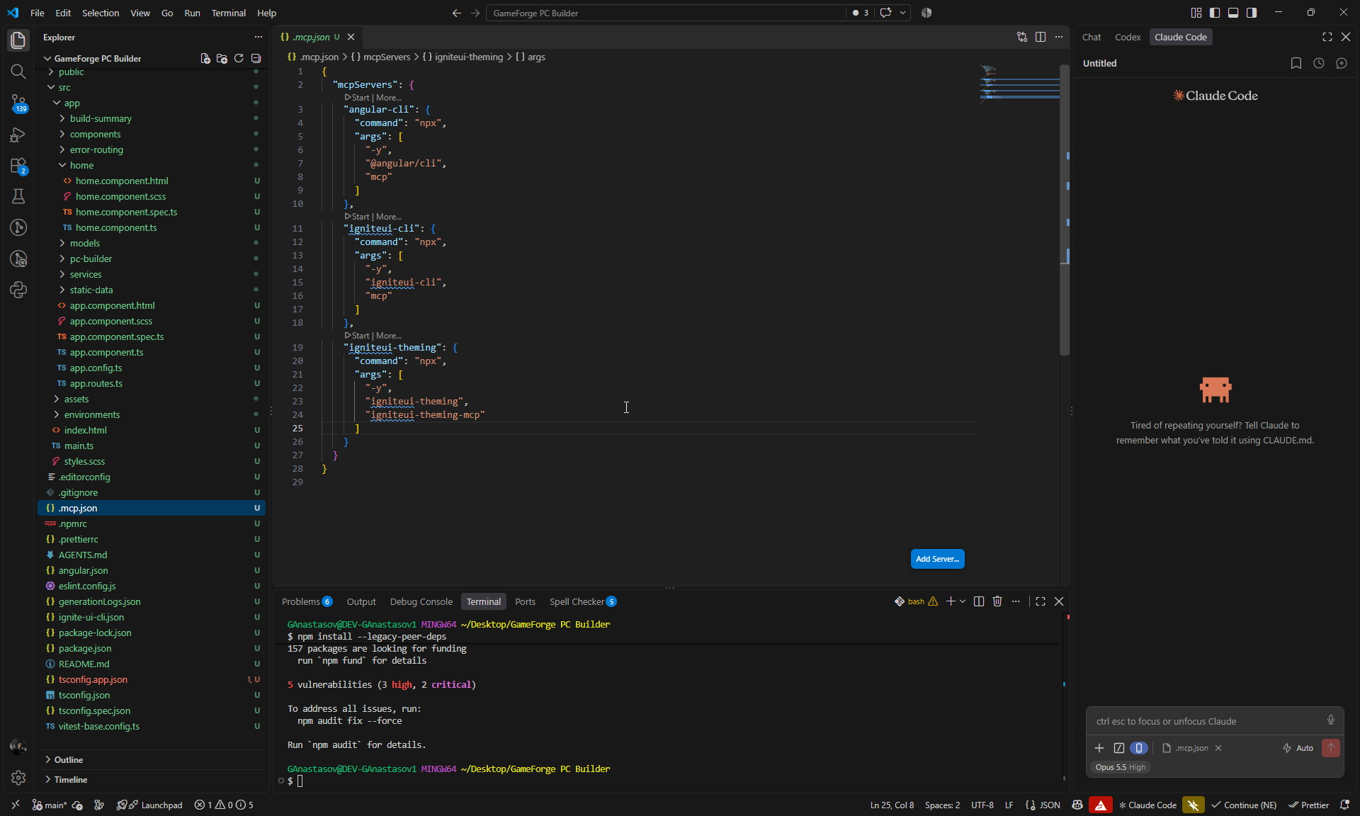
.mcp.jsonには、angular-cli、igniteui-cli、igniteui-themingの3つのMCPサーバーが設定されています。このワークフローで使用するのは、2つのIgnite UIサーバーです。- Ignite UI skillsがインストールされています:
igniteui-angular-components、igniteui-angular-figma-to-app、igniteui-angular-generate-from-image-design、igniteui-angular-grids、igniteui-angular-theming。
Claude CodeとIgnite UI MCPでGameForgeを動作させる
App Builderのデザインはそのまま維持します。Claude Codeは5つのステップで、その背後にある動作を構築します。
各プロンプトの書き方と検証方法
各プロンプトでは、既存のデザインを維持するようClaudeに指示し、関係するIgnite UIコンポーネントを明示したうえで、それらのAngular APIについてはIgnite UI MCPを参照するよう指示しています。各ステップの後、Claudeはビルド、lint、単体テストを実行し、その後PlaywrightでChromium上の変更されたフローを操作しました。すべてのステップでビルドとlintが成功し、コンソールエラーはありませんでした。
ステップ1:実データと共有のビルド状態
最初のプロンプトでは、サンプルデータを現実的なカタログに置き換え、4つのページすべてに1つの共有ビルド状態を持たせます。
You are working on an Angular application called GameForge PC Builder.

This app was created in App Builder with AI and then exported. We are using it for a technical blog showing how we continue from the generated App Builder UI with Claude Code, Ignite UI MCP, Ignite UI Theming MCP, and the installed Ignite UI Claude skills to turn it into a fully working application.

The current GameForge design is already finished and should be preserved. Do not redesign the app.

The project has four main pages:
- Home
- PC Builder
- Components
- Build Summary

First inspect the existing project so you understand its generated models, services, data structures, and bindings.

Then:

- Replace the App Builder placeholder data with realistic hardware data for CPU, GPU, Motherboard, RAM, Storage, Cooling, PSU, and Case.
- Use roughly 3 parts per category.
- Include the properties needed for pricing, power, and compatibility.
- Create 3 realistic featured GameForge build presets.
- Create a shared signal-based BuildStateService that owns the selected part for each hardware slot.
- Expose selected parts, filled slot count, and subtotal as shared/computed state.
- Make Home load a selected preset into the builder.
- Make PC Builder, Components, and Build Summary use the same hardware data and shared build state.
- Preserve the existing App Builder templates and styling.

Use the Ignite UI MCP when working with or verifying Ignite UI components, and use the relevant installed Ignite UI Claude skills where useful.
Claudeは8つのカテゴリーにそれぞれ3つずつ、合計24のパーツを追加しました。各パーツには、価格、消費電力、ベンチマークスコア、そしてソケット、メモリタイプ、フォームファクター、GPUの長さ、ケースのクリアランスなど、互換性チェックに必要なフィールドがあります。また、3つのプリセットを作成し、それぞれの価格をパーツの合計としました。
| プリセット | ティア | 価格 |
|---|---|---|
| Apex Titan | Flagship | $4,652 |
| Vanguard | Enthusiast | $2,542 |
| Raptor | Mainstream | $2,002 |
新しいシグナルベースのBuildStateServiceは、各スロットのパーツを保持し、選択されたパーツ、埋まっているスロット数、小計、アクティブなプリセットを公開します。Homeはこのサービスにプリセットを読み込み、他の3つのページはこのサービスからデータを読み取ります。
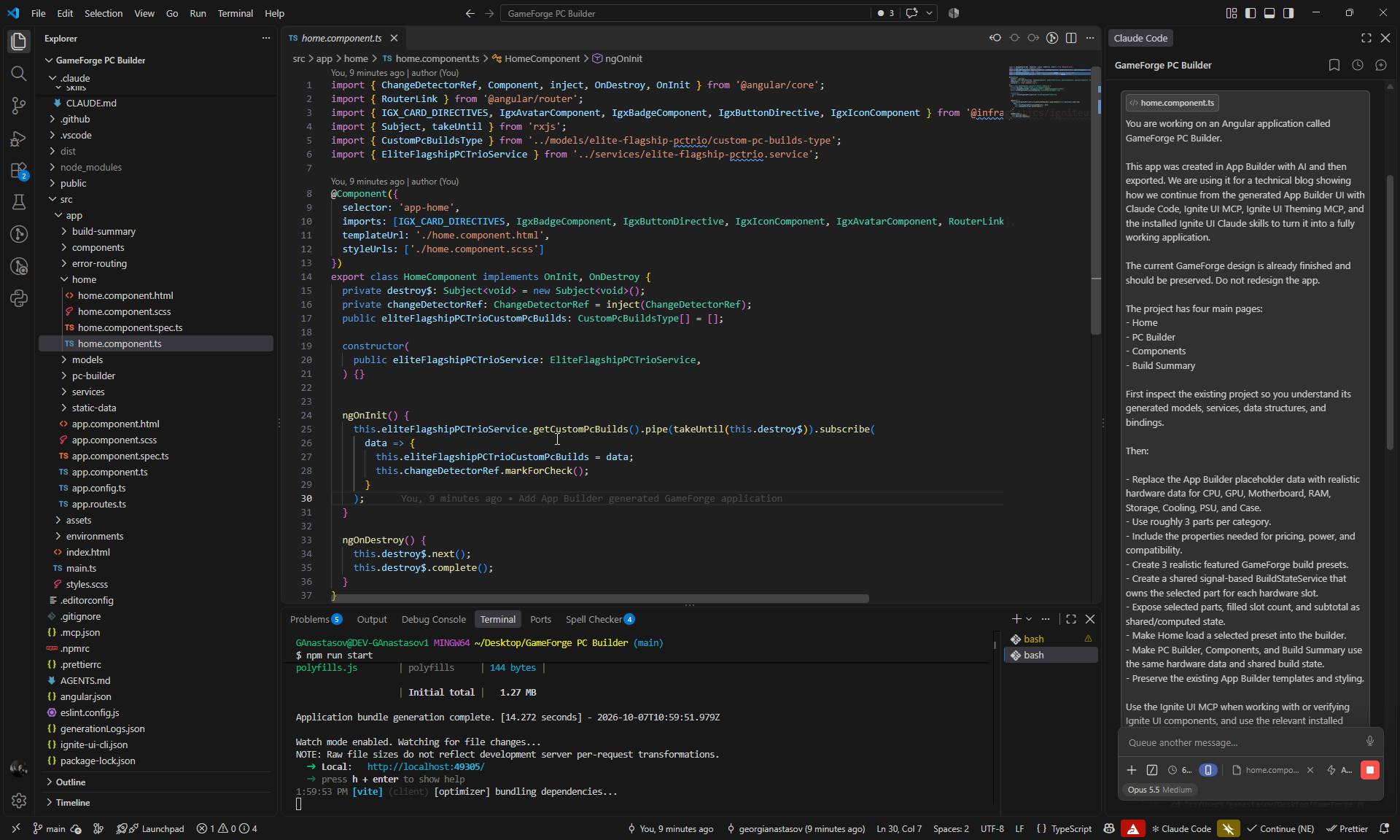
新しいモデルは生成されたモデルを拡張しているため、App Builderのテンプレートはバインディングを維持しました。Claudeは、使用されなくなった3つの生成済みサービスとそのプレースホルダーデータを削除し、ページコンポーネントをOnPush、inject()、シグナルに移行しました。
データには、ステップ4で検出させるための意図的な競合も含まれています。AMDのパーツと並ぶIntelのCPUとマザーボード、そして163 mmのNZXT H6 Flowケースに収まらない168 mmのNoctua NH-D15 G2クーラーです。
バッジ、リニアプログレスバー、Grid Liteをバインドする前に、ClaudeはIgnite UI MCPでそれらのAPIを確認しました。スタイルは変更されなかったため、Theming MCPは呼び出していません。
チェック: 12件の単体テストが成功、MCP呼び出し3回。
ステップ2:動作するカタログフィルター
次に、Componentsページに動作するフィルターを実装します。プロンプトでは、Claudeが参照すべき各Ignite UIコンポーネントを明示しています。
Make the existing Components page fully functional without changing its current design.

Use the Ignite UI MCP as the source of truth for the Angular APIs of the existing input, igx-select, igx-chip, dialog and snackbar components. Use the relevant installed Ignite UI Claude skills where useful.

Implement:

- Working search by part name, manufacturer and relevant specifications.
- Working Component Category filter.
- Working Performance Tier filter.
- Working Socket / Form Factor filter.
- Working Sort By.
- Make the existing quick-filter chips selectable and functional.
- Make Reset Filters clear all active filters and restore the full catalog.
- Update the visible component count automatically.
- Show a clear empty state when no parts match.

Use signals/computed state for the filtering and preserve the existing cards, layout, styling and hardware data.

Do not redesign the page or replace existing Ignite UI components unnecessarily.検索は、名前、メーカー、カテゴリー、ティア、ソケットまたはフォームファクター、仕様に一致するようになりました。igx-selectドロップダウンはシグナルにバインドされ、クイックフィルターチップは組み合わせて使用でき(Processors + GPUsで6つのパーツを表示)、“N Components Verified”のカウントはリアルタイムで更新されてスクリーンリーダーにも読み上げられます。また、一致するものがない場合は、専用のReset Filtersボタンを備えた空の状態が表示されます。
Ignite UI MCPのAPIリファレンスは、チップのイベント(onSelection)とスナックバーのメソッド(show/hide)について古い名前を返しました。ClaudeはそれらをMCPのチップガイドとインストール済みの型定義と照合し、代わりにselectedChanging、[selected]、open()、close()を使用したうえで、この発見を後のステップのためにメモリに保存しました。
Claudeは、プロンプトで依頼していない部分も変更しました。スナックバーのメッセージ、Review Rigボタン、Benchmarksダイアログ、Add to Custom Buildです。これらの変更は有用でしたが、次のステップと重複していたため、以降のプロンプトは範囲を制限する1文で締めくくっています。
チェック: 18件の単体テストが成功、MCP呼び出し5回。
ステップ3:PC Builderからパーツを交換する
このプロンプトではパーツの交換機能を追加し、顧客がPC Builderから現在のビルドの1つのパーツを入れ替えられるようにします。最後の1文が範囲の制限です。
Connect PC Builder and Components so users can replace a specific hardware part in their current build.

Preserve the existing design and the filtering functionality that already works.

Use the Ignite UI MCP when working with or verifying the relevant Angular component APIs, and use the relevant installed Ignite UI Claude skills where useful.

Implement:

- Make each existing Change Part action in PC Builder open `/components?slot=<slot>` for the correct hardware slot.
- On Components, read the `slot` query parameter and automatically filter the catalog to that hardware category.
- Clearly show which current part is being replaced.
- Mark the part that is already selected in the build.
- Make Select for Rig replace the part in that exact slot through BuildStateService.
- After replacement, show the existing confirmation snackbar with the old and new part names.
- Make Review Rig return to PC Builder, where the changed part and subtotal are immediately reflected.
- Make direct navigation to Components without a slot continue to behave as the normal full catalog.

Do not redesign anything and do not rework the existing filters, dialogs or snackbar behavior unless required for this flow.
各Change Partボタンは、そのスロットで絞り込まれたComponentsを開くようになりました(例:/components?slot=gpu)。バナーには交換対象のパーツが表示され、現在のパーツには”In Your Rig”のマークが付き、Select for Rigでそのスロットのパーツが入れ替わります。スナックバーで交換が確認され(“RTX 5080 replaced RTX 5090 in the GPU slot.”)、Review RigでPC Builderに戻ると、小計は$4,652から$3,652に下がっています。スロットを指定せずにComponentsを開いた場合は、引き続きカタログ全体が表示されます。
バナーは当初、テーマのプライマリカラーの最も明るいシェードを使用していましたが、その上のキャプションテキストがコントラストの基準を満たしていませんでした。Claudeは、プライマリカラーとサーフェスカラーを混ぜた色合いに切り替えました。
チェック: 21件の単体テストが成功、MCP呼び出し1回。
ステップ4:電力、互換性、価格のリアルタイム計算
PC Builderには、まだハードコードされたテレメトリーが表示されています。このプロンプトでは、それをリアルタイムの計算に置き換え、成功、警告、エラーの状態のためにIgnite UI Theming MCPを導入します。
Make the existing PC Builder telemetry, compatibility and pricing fully functional using the shared BuildStateService.

Preserve the current GameForge design and existing components.

Use the Ignite UI MCP as the source of truth for the Angular APIs of the existing IgxBadge, IgxLinearProgressBar, dialog and snackbar components.

Use the Ignite UI Theming MCP with platform "angular" to inspect the correct theme tokens and visual states for success, warning and error. Use the relevant installed Ignite UI component and theming skills where useful.

Implement live calculations for:

- total estimated power draw;
- PSU capacity, utilisation and remaining headroom;
- parts subtotal and build total;
- CPU and motherboard socket compatibility;
- RAM and motherboard compatibility;
- motherboard and case form factor compatibility;
- GPU length and case clearance;
- cooling and case compatibility;
- PSU capacity;
- whether all required hardware slots are populated.

Replace the existing hard-coded PC Builder values with these calculations.

Make the existing badges and progress bar react to the current build with clear success, warning and failure states based on the Ignite UI MCP and Theming MCP guidance.

Update the existing Review Build dialog so it shows the real 8 selected parts, current pricing, power information and any compatibility issues.

Make the existing assembly/testing options affect the calculated total.

Make Save Configuration actually persist the current build and restore it after a page reload.

Keep the implementation focused on the existing UI and do not redesign the page.
PC Builderは、現在のビルドから次の値を計算するようになりました。
- 電力: Apex Titanプリセットは1200 WのPSUで825 Wを消費し、“375W (31% buffer)“の余裕が残ります。負荷80%までは成功、80-100%は警告、100%超はエラーとなり、プログレスバー自体の状態によって設定されます。
- 互換性: 8つのチェックで、空のスロット、CPUソケット、RAMタイプ、マザーボードのサイズ、GPUの長さ、クーラーの適合と取り付け、PSUの容量を確認します。空のスロットに依存するチェックは、失敗ではなく保留として表示されます。
- 価格: 小計、組み立てのティア、サーマルチューニングのオプションによって、見積もり合計が決まります。
- Review Build: ダイアログには、実際のパーツ、電力、価格、問題点が一覧表示されます。競合や空のスロットがある間は、Proceed to Checkoutは無効のままです。
- Save Configuration: ビルドはブラウザーに保存され、再読み込み時に復元されます。カタログと一致しなくなった保存済みエントリーは無視されます。
警告とエラーの色には、Theming MCPで見つけたテーマのwarnトークンとerrorトークンを使用しており、パネル上でWCAG AAのコントラスト基準を満たしています。オプションの価格(Precision Stress-Testing $49、Extreme Benchmarking & Burn-in $149、Precision Thermal Tuning $79)は、Claudeが既存の文言から選んだデモ用の値です。
チェック: 36件の単体テストが成功、MCP呼び出し7回(Ignite UI MCP 2回、Theming MCP 5回)。
ステップ5:Build Summaryとチェックアウト
Build Summaryは、プレースホルダーの値が残っている最後のページです。このプロンプトでは、このページをチェックアウトに仕上げ、素のGrid Lite WebコンポーネントをAngularのコンポーネントに置き換えます。
Make the existing Build Summary page fully functional and synchronize it with the shared GameForge build state.

Preserve the current design and reuse the existing Ignite UI components.

Use the Ignite UI MCP as the source of truth for the Angular APIs of:
- IgxGridLiteComponent
- grid data binding, columns, sorting, filtering and cell templates
- IgxBadge
- IgxDialog
- IgxSelect
- IgxSnackbar

Use the igniteui-angular-grids and igniteui-angular-components skills where useful. Use the Ignite UI Theming MCP with platform "angular" only if status styling needs theme/token work.

Implement:

- Make Build Summary show the exact same selected parts, slot count, power, compatibility and pricing as PC Builder.
- Remove the remaining hard-coded summary values.
- Replace the current raw Grid Lite web component with the Angular IgxGridLiteComponent.
- Populate the grid from the real compatibility checks and use clear columns with pass/warning/fail status badges.
- Keep sorting and filtering working.
- Make shipping and payment selections functional.
- Calculate shipping, tax, payment discount and final total live.
- Use the existing checkout dialog with proper validation.
- Prevent ordering when the build is incomplete or has compatibility failures.
- Make Confirm & Place Order create a simple order id/snapshot, close the dialog, show the existing snackbar, and display an Order Confirmed state.
- Add a Start New Build action that resets the current build.
- Make Proceed to Checkout from PC Builder open Build Summary with the same current build.

Do not redesign the page or replace existing components unnecessarily.
Build SummaryにはPC Builderと同じビルドが表示されるようになりました。Apex Titanの場合、PC Builderの$4,701は、サマリーのハードウェア$4,652にテストの$49を加えた額と一致します。
- 互換性グリッド:
igc-grid-liteWebコンポーネントはAngularのIgxGridLiteComponentに置き換えられ、igx-badgeのステータス列とともに8つのチェックを表示します。すべての列で並べ替えと絞り込みが機能します。 - チェックアウト: 配送と支払いには、リアクティブフォーム内の既存の
igx-selectコンポーネントを使用します。配送料、銀行振込の割引、税金、合計がリアルタイムで更新されます(デモ用の料率)。 - 注文: ビルドが不完全な場合や互換性チェックに失敗した場合、Place OrderとConfirmは無効になり、その理由が表示されます。Confirm & Place Orderを実行すると、
GF-MUY3L5KH-2QO4のような注文IDとOrder Confirmedの状態が作成され、Start New Buildでビルドがクリアされます。
igniteui-angular-gridsスキルが、Grid Liteのセットアップ、インポート、セルテンプレート、Angularラッパーをガイドしました。新しい価格ルールは、App Builderの元の請求書の合計$3,086.37を正確に再現しています。また、単体テストによって1セントの丸め誤差も検出されました。$1,079の1.5%が$16.19ではなく$16.18になっていたのです。
チェック: 45件の単体テストが成功、MCP呼び出し4回。
数字で見るイテレーション1
ここから、このワークフローの効果が表れ始めます。5つのApp Builderプロンプトと63クレジットで、GameForgeは空のプロジェクトから洗練された4ページのデザインになりました。その後、フォーカスした5つのClaude Codeのステップで、そのデザインが動作するストアフロントになりました。実際のカタログ、共有のビルド状態、絞り込み、パーツの交換、電力と互換性のリアルタイムチェック、価格計算、構成の保存、チェックアウトです。最終的に45件の単体テストが成功し、各ステップの変更はブラウザーで確認されました。
5つのステップ全体で、ClaudeはMCPを20回呼び出し(Ignite UI MCPに15回、Theming MCPに5回)、Ignite UI skillsも使用しました。これらの呼び出しでは、コンポーネントのAPI、Grid Lite、ビルド状態に反応するバッジとプログレスバー、そしてステータスカラーの基になるテーマトークンを扱いました。各回答は、それを必要とするコードをエージェントが書いている最中に届いたため、コンポーネントの知識がそのまま動作する機能になりました。
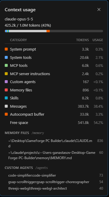
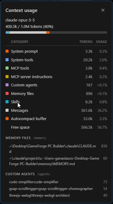
セッション終了時のコンテキストウィンドウ(Claude Code、Opus 5.5、1Mトークン)は次のとおりです。
| カテゴリー | トークン | 割合 |
|---|---|---|
| 使用済みコンテキスト | 425.2k | 43% |
| メッセージ | 383.7k | 38.4% |
| MCPツール | 6.0k | 0.6% |
| MCPサーバーの指示 | 2.4k | 0.2% |
| スキル | 8.2k | 0.8% |
| 空き | 541.8k | 54.2% |
このサポートが占めた領域はごくわずかです。MCPツールとサーバーの指示で8.4kトークン、ウィンドウの1%未満でした。この表はコンテキストウィンドウのスナップショットであり、セッションで消費されたトークンの総数ではありません。
イテレーション1は、完成した、動作するAngularアプリケーションで締めくくられます。10個のプロンプトで、GameForgeはアイデアからテスト済みのストアフロントになりました。UIのためにApp Builderで5つ、動作のためにIgnite UI MCPとともにClaude Codeで5つです。
イテレーション2:Admin Backofficeの追加
イテレーション1の終わりには、GameForgeは動作しています。顧客はビルドを構成し、互換性を確認し、注文できます。しかし、実際のプロジェクトがその時点で終わることはほとんどありません。最初のバージョンが完成した後に新しい要件が届き、デザインは変わり、新しい機能は、最初に生成されたものから大きく進化したコードに組み込む必要があります。
ここでは、その状況を意図的に再現します。新しい要件は、コンポーネント、価格、在庫と販売可否、顧客の注文を管理するためのAdmin / Backoffice機能です。
App Builderに戻って新しい画面をデザインし、その後、App Builderでの変更点だけを、Claudeがすでに構築したAngularアプリケーションへの入力として使用します。Claude Codeは、Ignite UI MCPサーバーとスキルを活用して、イテレーション1の作業を上書きすることなく、既存のアーキテクチャに新しい機能を統合します。
次のイテレーションの準備
Adminの作業を始める前に、プロジェクトの両方のバージョンをGitHubに公開します。
ClaudeのプロジェクトをGitHubに公開する
イテレーション1のすべての作業を含むAngularプロジェクトは、専用のリポジトリに公開します。このプロジェクトは引き続きメインプロジェクトであり、信頼できる唯一の情報源です。
App Builderのベースラインを公開する
App Builderプロジェクトは、App Builderで新しい変更を加える前に、別のリポジトリに公開します。
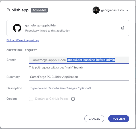
App BuilderはプロジェクトをmainへのPull Request(ここではPull Request #1)として公開し、このPull RequestはAdminの作業を始める前にマージします。ベースラインがmainにあることで、App BuilderがAdminの要件のために生成するものはすべて、ベースラインに対するクリーンな差分として表示されます。
新しい要件:Admin Backoffice
管理者には、カタログ、在庫、価格、顧客の注文を管理するエリアが必要です。App Builderでは、ナビゲーションのAdminエントリー、Admin Loginページ、Backofficeページがこれにあたります。Angularアプリケーションはエクスポート後に大きく変更されているため、更新したApp Builderプロジェクトをそこにマージすることはしません。代わりに、次の手順を実行します。
- App BuilderプロジェクトにAdminページを追加します。
- 更新内容を、Pull Requestとともに新しいブランチに公開します。
- GitHubでブランチをベースラインと比較し、正確な差分を確認します。
- メインプロジェクトで、App Builderの両方の状態をフェッチし、Gitで差分を確認します。
- Claude Codeに、既存の機能を上書きせずに、Admin関連の変更だけを統合させます。
- 新しいAdmin UIを、既存のデータ、注文、状態に接続します。
App BuilderでAdmin機能を構築する
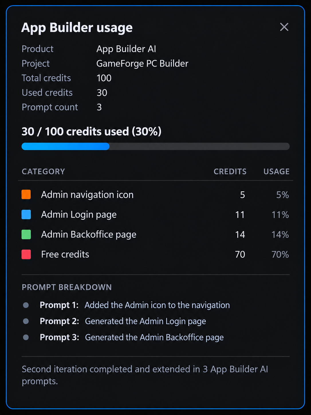
2回目のイテレーションは、残り37クレジットの状態から始まり、3つのプロンプトを使用します。
ナビゲーションにAdminエントリーを追加する
Add a new Admin entry at the far right of the existing top navigation bar.

Use a clear admin-style icon together with the label "Admin".

Keep it visually consistent with the current GameForge navigation and overall light high-tech design.

When clicked, it should navigate to a new page called "Admin Login".
App Builderは、Master Viewのナビゲーションの右端に、管理者アイコン付きのAdminボタンを追加しました。共有ヘッダー内にあるため、すべてのページに表示され、Backofficeのフローの起点になります。
クレジット: 5(100のうち68を使用)。
Admin Loginページを生成する
Add a new page called "Admin Login".

Create a clean, modern login page for the GameForge backoffice that matches the existing light high-tech design.

Use the same container-based layout approach as the rest of the application so the page feels fully consistent with the existing structure, spacing, and alignment.

Place the login content inside a centered main container with a focused inner login panel.

Include:
- GameForge / Backoffice branding
- "Admin Login" title
- short subtitle explaining that this area is for administrators
- Email field
- Password field
- prominent Sign In button
- secondary Back to Store action

Keep the page simple, polished, and visually consistent with the rest of the GameForge application.
App Builderは、GameForgeのライトテーマで、中央揃えの認証レイアウトを持つAdmin Loginページを作成しました。ログインフィールドとBack to Storeアクションを含み、Adminエントリーからこのページに移動できるよう接続されています。
クレジット: 11(100のうち79を使用)。
Admin Backofficeページを生成する
Add a new page called "Admin Backoffice".

Create a polished, modern administration dashboard for managing the entire GameForge application.

The page should feel like a real backoffice product, not just a regular content page. It should be easy to scan, easy to operate, and visually consistent with the existing GameForge light high-tech design.

Use the same container-based layout approach, spacing, cards, typography, borders, and overall visual language as the rest of the application.

Structure the page around one clear main admin workspace with these areas:

1. Admin Overview
Create a compact dashboard header and summary cards for:
- Total Orders
- Pending Orders
- Revenue
- Low Stock Components

2. Orders Management
Add a clear, data-rich management section where administrators can quickly review and manage customer orders.

Show:
- Order ID
- Customer
- Date
- Total
- Payment
- Status
- Actions

Use clear status badges and make each order easy to review or update.

3. Components Management
Add a dedicated hardware management section for maintaining the PC component catalog.

Show:
- Component image
- Component name
- Category
- Price
- Stock
- Availability
- Actions

Include prominent actions for:
- Add Component
- Edit Component
- Delete Component
- Update price
- Update stock
- Change availability

Make the page feel operational and practical, with strong hierarchy, clear actions, and well-separated management areas.

The final result should look like a professional GameForge admin dashboard from which an administrator could manage the store, hardware catalog, inventory, and customer orders.
App Builderは、概要の指標、Orders Management、Components Management、在庫管理コントロールを備えたBackofficeダッシュボードを、アプリの他の部分と同じビジュアルスタイルで作成しました。後の統合作業は、この構造をもとに進めます。
クレジット: 14(100のうち93を使用)。Admin機能には、残り37クレジットのうち30を使用しました。
更新内容をブランチに公開し、GitHubで比較する
更新したApp Builderプロジェクトは、Pull Requestとともに別のブランチに公開します。GitHubはそれをベースラインと比較し、App BuilderがAdminの要件のために追加または変更した内容を正確に表示します。
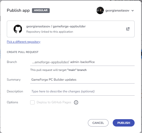
Adminの差分をメインプロジェクトに取り込む
2つのプロジェクトは別々のリポジトリのままにし、差分のうち有用な部分だけを取り込みます。
Gitで差分を確認する
メインプロジェクトでは、次のコマンドで以下を行います。
- 最新の
mainから、統合用ブランチganastasov/admin-backoffice-integrationを作成します。 - App Builderのリポジトリを2つ目のリモート
appbuilderとして追加します。 - ベースライン(
appbuilder/main)と、AdminのPull Request(#2)をローカルブランチappbuilder-adminとしてフェッチします。 - App Builderの2つの状態の間で変更されたファイルを、ファイルごとの変更の概要とともに表示します。
git checkout main
git pull origin main
git checkout -b ganastasov/admin-backoffice-integration

git remote add appbuilder https://github.com/georgianastasov/gameforge-appbuilder.git
git remote -v

git fetch appbuilder main
git fetch appbuilder pull/2/head:appbuilder-admin

git diff --name-status appbuilder/main..appbuilder-admin
git diff --stat appbuilder/main..appbuilder-admin
これらのコマンドは、AdminのPull Request(#2)がまだオープンだった時点で実行したものです。その後マージされたため、現在のappbuilder/mainにはAdminの変更が含まれており、ベースラインとしては使えません。マージ後に同じ比較を行う場合は、ベースラインのPull Request(pull/1/head)をフェッチして、それと比較してください。
App Builderからメインプロジェクトには何もマージしません。マージすると、ステップ1で削除したサービスを含め、生成されたコードが進化したアプリケーションを再び上書きしてしまいます。差分を確認する方法なら、メインプロジェクトを信頼できる唯一の情報源として維持できます。
Admin機能を統合する
1つの実装プロンプトで、未決定の事項を決め、統合を依頼します。
The analysis looks good. Proceed with the integration.

Use these decisions:

- Add Component should support the full hardware data required by the existing compatibility system. Make the additional specification fields category-aware where appropriate so an admin is not presented with irrelevant fields.
- Add a Customer Name field to the existing checkout flow so newly placed orders can display a real customer name in the Admin Backoffice.
- Use one simple demo admin credential for this application. This is demo client-side authentication, not production security.
- Inventory must affect the storefront. Admin stock and availability changes should be reflected in the customer-facing Components / PC Builder experience.

Implement the Admin experience using the current application as the source of truth.

Use the App Builder delta as the visual/design source for:
- Admin navigation entry;
- Admin Login;
- Admin Backoffice layout and styling.

Do not copy the generated placeholder services, static data, or duplicate hardware model architecture.

Implement the integration properly using the existing application architecture and conventions.

The final flow should support:

- Admin login and guarded Backoffice access.
- Admin logout/session handling.
- Real overview KPIs derived from application state.
- Order history containing seeded demo orders and newly placed customer orders.
- Customer name, payment status, and fulfillment status.
- Admin order status management.
- Inventory management per hardware part.
- Stock and availability updates.
- Hardware price editing.
- Adding new hardware components with the specifications required by the compatibility system.
- Discontinuing/removing components safely without breaking existing presets or saved builds.
- Admin catalog changes reflected in the customer storefront.
- Admin inventory changes reflected in the customer storefront.
- Existing PC Builder, compatibility, pricing, saved builds, Build Summary, and checkout behaviour must continue to work.

Follow the current project conventions:
- signals where appropriate;
- `inject()`;
- `ChangeDetectionStrategy.OnPush`;
- reactive forms;
- lazy-loaded admin routes;
- existing Ignite UI patterns and components.

Use Ignite UI MCP and the installed Ignite UI skills when they are useful for component APIs, grids, dialogs, forms, exporters, or other Ignite UI implementation details. Validate any MCP information against the installed project version when necessary.

Preserve the visual design generated by App Builder as closely as practical while adapting its behaviour to the current architecture.

Add or update tests for the new functionality and run the existing test suite, build, and lint checks.

After implementation, report:
- files added or changed;
- how the App Builder delta was adapted;
- how the new Admin state connects to the existing storefront;
- tests/build/lint results;
- Ignite UI MCP or skill usage during this implementation.
ClaudeはApp BuilderからHTML、SCSS、レイアウト、アイコン、ビジュアル構造を取り入れました。生成されたプレースホルダーサービス、重複するモデル、静的データはコピーせず、生成されたロジックはプロジェクトの規約に沿って書き直しました。ログイン、ダッシュボード、注文管理に加えて、この統合では、新しいコンポーネント向けのカテゴリー別の仕様フィールド、永続的な注文履歴、そしてパーツを削除する代わりとなるDiscontinue / Restoreが追加されています。
ストアフロントとBackofficeを接続する
Backofficeとストアフロントは同じ状態を共有しているため、変更は双方向に反映されます。
- 価格の編集は、PC Builder、Build Summary、Homeのプリセット価格、Componentsに反映されます。
- 新しいコンポーネントは、すぐにストアフロントに表示されます。
- 販売終了したコンポーネントは新規の選択肢から非表示になりますが、既存のビルド、プリセット、過去の注文には残ります。
- 在庫と販売可否によって顧客が選択できるものが決まり、ビルド内に販売できないパーツがあるとチェックアウトがブロックされ、交換すべきパーツが示されます。
- チェックアウトではCustomer Nameの入力が求められるようになり、在庫が減って、Backofficeに注文が作成されます。
フロー全体を検証する
シナリオ全体をChromiumでテストしました。
- Backofficeを開くと、Admin Loginにリダイレクトされます。
- 無効な認証情報ではエラーが表示されます。
- 管理者がサインインします。
- 新しいRTX 5070 Tiを追加します。
- RTX 5090の価格を$1,899に変更し、在庫を0に設定します。
- ストアフロントには、新しい価格と”Out of Stock”がすぐに表示されます。
- 選択したRTX 5090が販売できないため、Build Summaryでチェックアウトがブロックされます。
- コンポーネントを再入荷します。
- “Jordan Lee”という顧客がチェックアウトを完了します。
- 新しい注文が、Admin Backofficeの注文グリッドの先頭に表示されます。
- Sign OutでHomeに戻ります。
フローはコンソールエラーなしで実行され、lintもクリーンで、本番ビルドも成功しました。
数字で見るイテレーション2
2回目のイテレーションは、プロジェクトが進化した後でもこのワークフローが機能し続けることを示しています。さらに3つのApp Builderプロンプトと30クレジットで、完全なAdmin / Backoffice機能をデザインしました。ナビゲーションエントリー、ログインページ、そして注文、コンポーネント、在庫を管理するダッシュボードです。その後、Gitの差分によって、そのデザインを、エクスポート後に大きく変更されたアプリケーションに、イテレーション1の作業を一切上書きすることなく取り込みました。
| 指標 | イテレーション2 |
|---|---|
| App Builderクレジット | 30(両方のイテレーションで100のうち93) |
| 単体テスト | 実施前45件、実施後105 / 105件(+60) |
| Ignite UI MCPの呼び出し | 5 |
| Ignite UI Theming MCPの呼び出し | 2 |
| Ignite UI MCPの呼び出しの合計 | 7 |
| 使用したスキル | igniteui-angular-grids |
Claude Code、Ignite UI MCPサーバー、igniteui-angular-gridsスキルによって、生成されたAdminページは、アプリの他の部分と接続された動作する機能になりました。グリッドスキルは、Adminのigx-gridのセットアップ、インポート、igxCellテンプレート、行選択、Excelスタイルのフィルタリング、CSVエクスポート、サイズ設定をガイドし、Theming MCPはデザイントークンを提供しました。フォームとダイアログにはMCPの直接的なサポートは不要で、アクセシビリティはブラウザーとaxeによるテストで確認しました。イテレーション1でIgnite UIのパターンがすでに確立されていたため、MCPの呼び出しは7回で十分でした。
テストスイートの成功件数は45件から105件に増えました。Backofficeで行った価格、在庫、カタログの変更はすぐにストアフロントに反映され、顧客の注文はBackofficeに流れ込みます。
Adminセッションの終了時、コンテキストウィンドウは1Mトークンのうち400.5k(40%)を使用していました。MCPツールとサーバーの指示は6.2kトークン(約0.6%)、スキルは8.2k(0.8%)でした。
3つのApp Builderプロンプトと1つのClaudeの実装プロンプトで、動作するストアフロントに動作するBackofficeが加わりました。このワークフローは、アプリケーションを作成するときだけでなく、新しい要件が届いたときにアプリケーションを成長させるうえでも役立ちます。
イテレーション1と同様に、下のApp Builderクレジットの画像は概要を示すイメージ図で、App Builderの実際の画面ではありません。
App BuilderとIgnite UI MCPの相性が優れている理由
App Builder AIとIgnite UI MCPは、同じ作業の異なる半分をそれぞれ担当します。GameForgeは、両者がいかにうまく組み合わさるかを示しています。
App Builderは、コストのかかる初期段階を引き受けます。空のプロジェクトから、5つのプロンプトで、ページ、レイアウト、ナビゲーション、Ignite UIコンポーネント、データ構造、スタイル、そしてすべてのビューで一貫したエクスペリエンスを備えた、構造化されたアプリケーションが生まれました。コーディングエージェントは、その構造をゼロから考え出す必要がありませんでした。実際の基盤から作業を始められたのです。さらに、App Builderは標準的なAngularプロジェクトをエクスポートし、GitHubに公開できるため、作業はビジュアルツールの中にとどまることなく、通常の開発ワークフローの中で一般的なコードプロジェクトとして継続されます。
Ignite UI MCPは、引き渡しの時点から役割を引き継ぎます。Claudeは動作するコードベースから作業を始め、MCPサーバーによって、必要なIgnite UIのドキュメント、コンポーネントAPI、テーマトークンに直接アクセスできます。エージェントは、UIを作り直すのではなく、データ、状態、ビジネスルール、統合、反復作業にコンテキストを使うことができます。正しいチップのイベント、Grid Liteのセットアップ、warnとerrorのトークンが必要になったときも、推測するのではなく、調べて確認しました。MCPツールとサーバーの指示は、どちらのセッションでもコンテキストウィンドウの1%未満にとどまりました。
最も強力な証拠は2回目のイテレーションです。コードベースが元のエクスポートから大きく進化した後でも、App Builderは完全なAdmin / Backofficeエリアをデザインし、Gitは変更点を正確に切り分け、Claudeはストアフロントを壊すことなくそれを統合しました。両方のイテレーションを通じて、GameForgeに要したのは8つのApp Builderプロンプトと、100クレジットのうち93クレジットです。最終的に、リアルタイムの価格計算、互換性チェック、在庫、チェックアウト、そしてAdminとストアフロントの間を行き来する注文を備えた、完全なストアフロントとBackofficeが完成し、そのすべてが105件の成功したテストで裏付けられています。
App Builderを使えば、強固なアプリケーション基盤をすばやく構築できます。そしてIgnite UI MCPによって、コーディングエージェントは最も価値を生む部分、つまりその基盤を実際の製品に仕上げ、さらに進化させ続けることに、その知性を注ぐことができます。
これは、単なる高速なプロトタイピングの手段ではありません。アイデアからデザイン、コード、動作するアプリケーションへ、そしてその後に続くイテレーションまでをつなぐ、実践的な道筋です。