Using Figma Auto Layout With App Builder To Speed up Design to Code
Here’s a quick trick: you can accelerate the design-to-code process with the help of low-code App Builder and Figma Auto Layout. See how to do it.
Auto-layout is a popular feature in Figma, a vector design tool commonly used to create visual design specifications. One reason behind the popularity of Auto-Layout is that it lets you create designs that can adapt or resize automatically based on changes to the size of the layout. While designers appreciate the resizing aspect, it also pays dividends when sharing hand-off artifacts for development.
This article is intended to help UI/UX designers and web app developers who work on handoffs and want to take advantage of tooling around design-to-code processes to deliver faster than ever.
The Problem With Hand-Offs
Hand-off artifacts represent UX specifications that are used by development teams to build the final solution. However, there has always been friction between artifacts created by the design team and developer requirements. This friction can be traced back to static layouts and specifications created in design tools vs. adaptive layouts for implementation. This friction is further aggravated by the development team manually (re)implementing the designs based on static specifications. This triggers an inefficient review process to check whether the implementation matches the design specifications.
The App BuilderTM Solution

Auto-Layout helps bridge the two worlds of design and development when it comes to specifying UI layouts. By using dynamic sizing for UI elements, and relative positioning, designs in Figma end up closer to expected web layouts (i.e., CSS Flexbox). But this still does not end the problem of having to (re)implement designs—and where App Builder fits in.
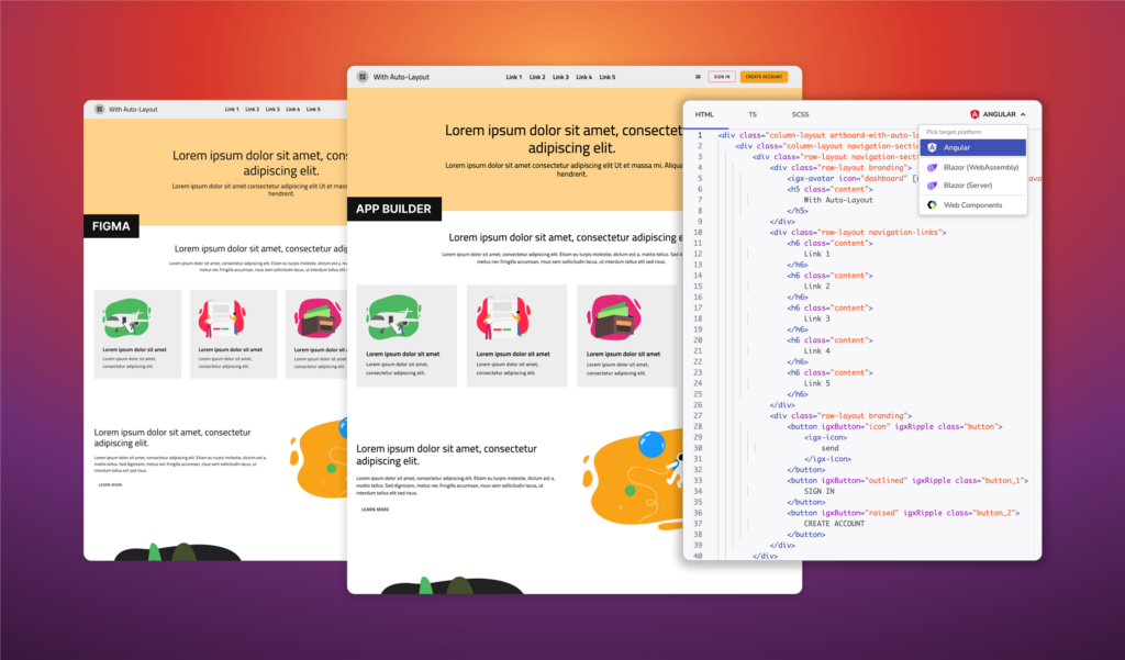
On its own, App Builder allows software teams to rapidly design and generate web apps for Angular, Blazor, and WebComponent from scratch. For designs created in Figma, App Builder works as a force-multiplier by dropping the need to manually implement the designs. If the designs are created using the Indigo.Design UI kit for Figma, you can publish the designs as pixel-perfect apps that can be edited in App Builder. In other words, getting rid of static specifications and tedious reviews. And it goes one step further– the app created from Figma makes use of professional UI components, design tokens for consistent themes, and CSS Flexbox layouts based on Auto-Layout settings.
What Is Auto Layout in Figma?
Auto Layout enables designers to create adaptive designs that can quickly accommodate any size changes in the layout or the content. This way designed content expands or shrinks as needed while keeping consistent spacing and alignment.
Given that users control the width of their browser windows, it is best to skip using fixed height and widths unless needed. Instead, it is better to consider fluid sizing and relative spacing such that content can reflow based on available space. One of the most basic examples that integrates auto layout is a button such that the button size can expand or shrink based on the added text.
How To Use Auto Layout in Figma?
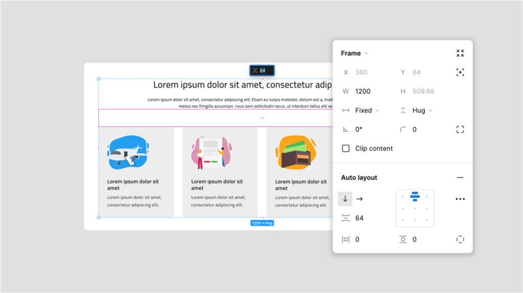
To enable Auto-Layout, UI elements must be added to a Frame in Figma. Frames are like a DIV in web-layouts. After enabling Auto-Layout, the UI elements inside the frame are positioned relative to each other as opposed to being positioned absolute (x, y). Positioning UI elements relative to each other makes it easier to re-order the elements without having to adjust any spacing.
Following is a quick summary of what is available when Auto-Layout is enabled:

Direction |
Defines whether stacking of child layers is horizontal or vertical within a container.
|
Alignment |
Alignment controls how child elements are positioned within a frame. One can override alignment settings for any child element using absolute position. The alignment property can take on the following values:
|
Spacing |
It can be vertical or horizontal spacing based on direction and it defines the spacing between each child element. |
Padding |
Determines the whitespace around objects and can be top & bottom, left & right, custom. |
Resizing |
It can be vertical and horizontal for child items of a Frame, with three possible values:
|
Learn more about how to use Auto-Layout
How Does Auto Layout Work With App Builder?
As mentioned above, Auto layouts are equivalent to CSS Flexbox containers (DIVS). And App Builder canvas uses Flexbox layouts natively. The key value delivered by App Builder is to convert your static designs into web apps that can be edited in the cloud. To get the best outcome, your designs should meet four basic requirements:
- All layouts are created using Figma Auto-Layout (with Frames)
- The designs are created using components from Indigo.Design UI kit
- Typography and colors are set based on UI kit tokens
- To extract portions of the UI as a vector illustration (SVG), mark layer for export in Figma
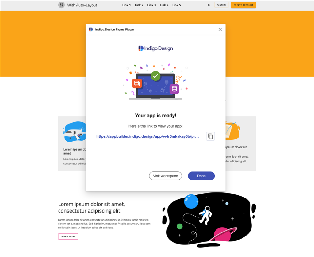
And finally, you’ll need the Indigo.Design Figma plugin to export your designs as a finished app. Check out our previous blog post where we describe the process of going from design to code.

Accelerating The Design-To-Code Process
Figma Auto-Layout is a feature that helps designers create UI designs faster and easier. It does this by:
- Automatically adjusting the size of objects based on layout size or content.
- Ensuring that the spacing in your design is consistent, even when it gets more complicated.
- By positioning UI elements relative to each other, the design works well on all devices.
- Developers will love it too because the design specifications are closer to what they expect, especially for web design.
App Builder adds value to the hand-off process by eliminating the need to re-implement the designs. This makes the process of going from design to code faster and more reliable. When the designs are published using the Indigo.Design plugin for Figma, App Builder automatically converts the static designs into a web app.
The resulting web app gains several benefits:
- Makes use of CSS Flexbox layouts.
- Static components are replaced with production-ready UI components.
- Variables for colors and typography that are linked to a global theme.
- Allows developers to edit the web app, and generate app source code for Blazor, Angular and Web Components.
Ready to give this a try?

