
Getting Started With App Builder Grid Column Templates
What is a Grid Column Template? How can you start using it in your next application in a time-efficient manner? This blog post will show you the way.
Imagine that you have a data source that has different fields for First and Last name and Address details like – street, city, and postal code. With the latest App BuilderTM Ultimate 23.1 Release, you can combine them all into one Cell Display value and reduce the visible columns. And in this App Builder how-to tutorial on Column Templates, we will demonstrate how to handle similar things and go from a basic grid to a grid with templates – a display template.
Let’s get started.
Introduction to Basic Grids vs. Grids With Templates
A “grid” typically refers to a layout structure that organizes content or UI elements in a two-dimensional grid-like pattern. It divides the layout of an app into rows and columns containing different data, depending on the app’s purpose. For the purpose of this tutorial, we’re starting with a basic grid that comes with some default templates. It also implements features like filtering, sorting, and pinning, which are very easy to enable and use on top of the grid.
To turn it into a more advanced and customized grid, we will also use:
- One-column template for the display.
- And another one that handles what it should look like when you’re editing a particular cell.
What Is a Column Template?
Grid Column Templates are used for creating customized layouts and content inside a particular column. When building an app, whether it’s a web application or a mobile app with a web-based UI, using Grid Column Templates can bring several benefits:
- Achieving responsiveness and defining the behavior of columns on different screen sizes.
- Establishing a more consistent and easier-to-maintain grid structure with coherent visual experience.
- Having more efficient use of space within the layout with adjustable column widths matching any screen resolution.
- Providing flexibility and precise control over the app’s visual appearance when it comes to arranging complex UI elements and aligning different items.
- Improving the readability and maintainability of the code by setting up clearer names for grid areas.
- Prompting reusability by enabling you to create modular layouts.
- Supporting multi-column layout, which is extremely useful for content-heavy UIs or dashboards.
What else can you do with the new Column Template capability in App Builder?
- URL data fields can now be associated with a custom Image component.
- Show a Rating component and give a visual clue on certain numeric values.
- Provide a more visual way to indicate that certain column contains Phone numbers.
Getting Started With App Builder Grid Column Templates
Getting Imagery Into the Grid
The quickest way is to get back to the editor in App Builder (Edit Time Experience In The Grid), and for each of the grid, all the child elements are columns, and you can select your avatar URL, which displays the grid column property. Another option is to select “image” from the “Display Format,” which automatically replaces it with an image that can be further customized to have an avatar with a first name and last name.
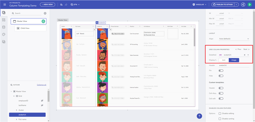
In our case, let’s show the avatar, the first name, and the last name. What we need, then, is just “display,” so we have to enable it within the App Builder. There’s a hint for drop content in the upper left corner. You can go ahead and drag and drop the Avatar Component from the toolbox and add it in place.
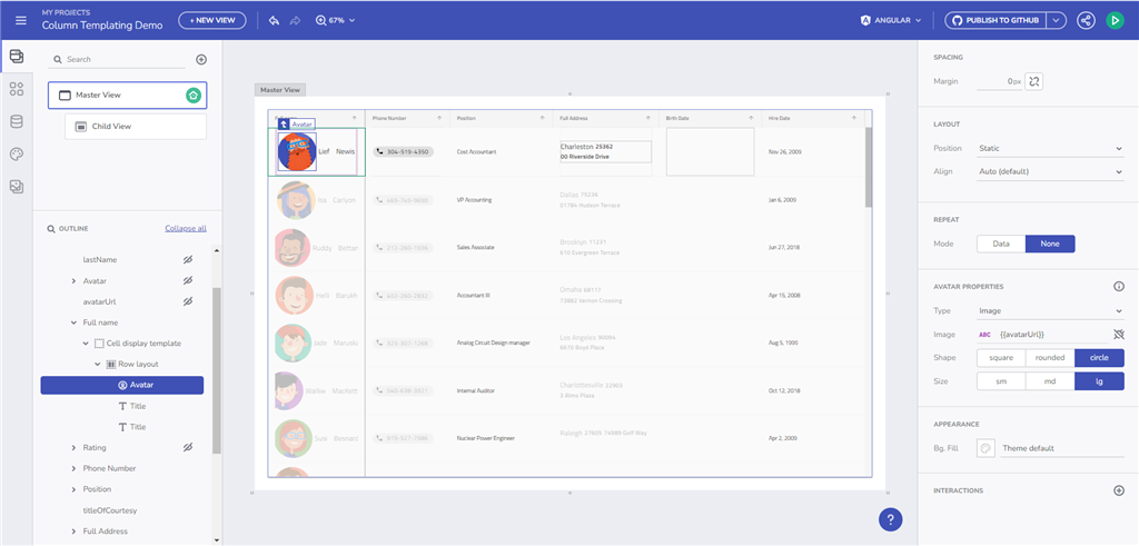
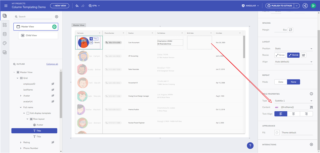
Then, continue editing the cell display template, add two text elements, and set a certain size. Then bind the first text element to “first name”, the second text element to “last name”, and for the Avatar, you can choose from an icon and select image, which exposes the binding option. In the binding option, this particular data source has the necessary Avatar URL that we simply plug in.
Controlling the Layout
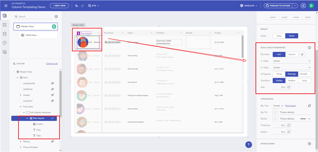
By default, the template doesn’t provide any layout directions. So, in order to control the layout, you will need to add your own layout inside and then start dropping components or do it after the fact.
Then, we get the default Flex container, where you can specify the alignment, gap property, margins, etc.
Binding and Chip Component
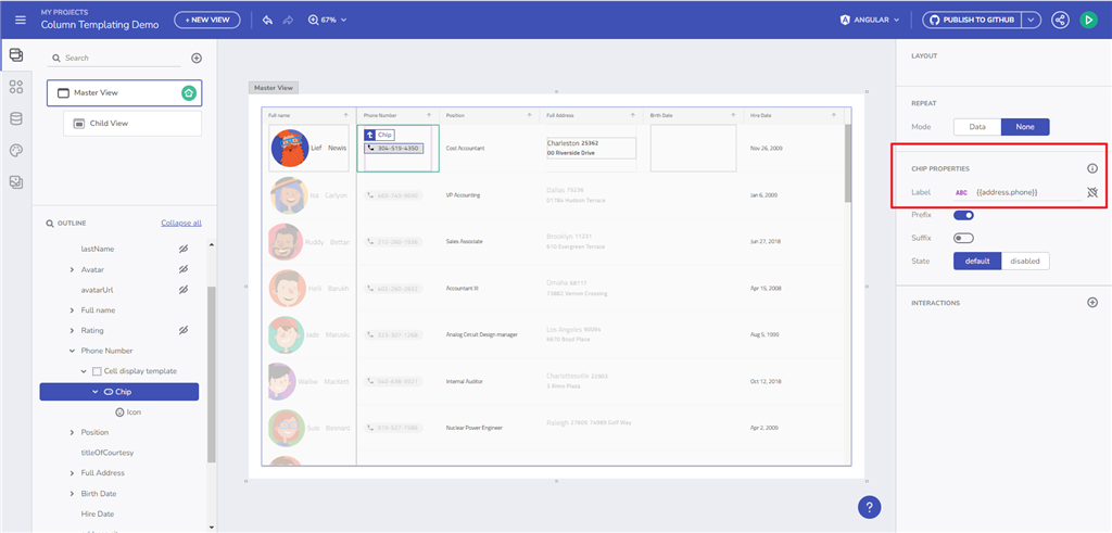
The other quick thing we will do now is put a Chip Component inside a phone number. Go ahead and select your designer, click on address phone and name it, and change the cell display template inside the column. It will go blank. Then drop a Chip Component and add the phone functionality by picking an item. The actual content of the chip (which will appear with a default binding), you can further specify it to “phone number”.
Changing the Title Area To Show a Select Box
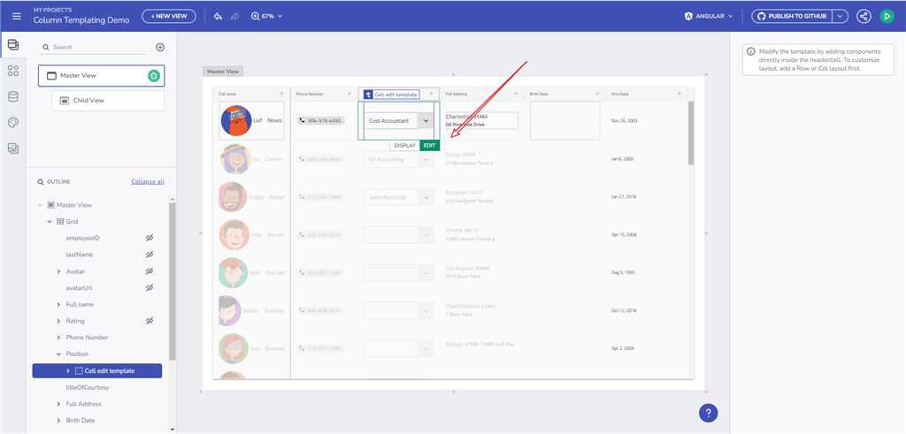
The process is pretty much the same. You select a title, you switch between display and edit that appear on top of the cell. When editing, drop a clean Select Box in there. After that, you can select your options. In the end, you have a Display Template and an Edit Template in your grid whit a nice and clean Select Box.
And you are all set up. Click Preview to see what you’ve built.
Wrap Up…
In this quick how-to App Builder tutorial, we showed you how to use a Display Template to build a custom layout and how to modify the Edit Template to create a different component. This way, you are enabled to create a customized layout for all your grids and experience the grid with the same performance but now with the benefit of templates.
You can also watch the webinar that demonstrates all of the steps.

