
Keep Building: What's New in App Builder 26.1
From AI theme extraction to a brand-new Tooltip, App Builder 26.1 packs six months of improvements that make every step of the app-building journey faster, smarter, and more resilient.
Radoslav Mirchev 4min read
App Builder has had a busy first half of 2026. Between new components, a complete versioning system, and a steady stream of AI improvements, the platform has grown in ways that touch nearly every part of the workflow — from the first prompt to the finished layout.
This post covers everything that shipped from December 2025 through May 2026. Some of these releases have their own dedicated posts; here you’ll find the full picture in one place.
December 2025: Smarter Diagnostics and a Fresh Start
If you’ve ever spent time hunting for a broken binding buried three levels deep in a complex app, the Centralized Notification UI is for you. All design-time errors and warnings now surface in a single aggregated view, so you can see every issue at once and jump directly to the source instead of discovering problems one by one.
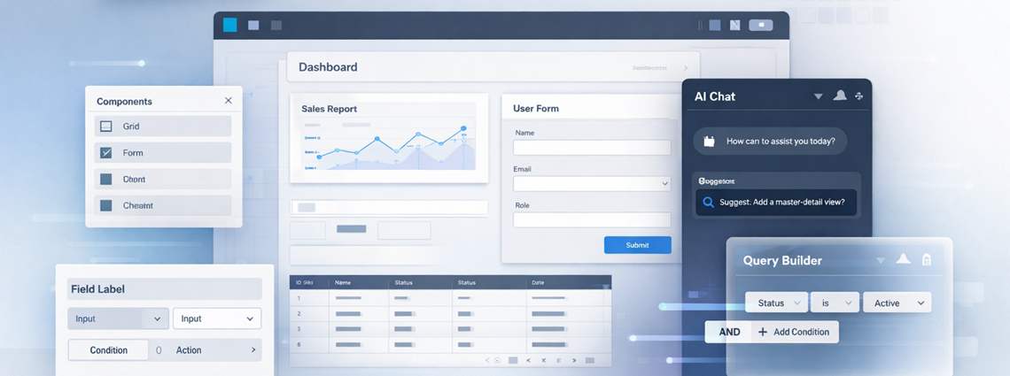
Angular developers also got a powerful new tool: the Query Builder component. Drop it into your layout as a standalone filtering UI, or use it as an advanced variable editor to drive complex filtering logic across your app. Either way, building sophisticated data queries no longer means writing it by hand.
We also took a hard look at the “Create New App” dialog — the first thing you see when starting a project. The redesigned interface is cleaner and more useful, with a Prompt Gallery to spark ideas and a Your Prompts tab that keeps your previous inputs one click away.
Finally, AI generation got meaningfully better for three layout types that are notoriously difficult to generate well: full-page blog layouts, dynamic image galleries and carousels, and Kanban boards. The structural accuracy improvements here are the kind you notice immediately when the generated output actually matches your intent.
This release was covered in depth in the Year-End Release blog post.
February 2026: New Components, On-Canvas AI Editing
Two new components joined the toolbox this release: Navigation Tabs and Grid Lite.
Navigation Tabs brings tab-based navigation with automatic route-based selection — the active tab follows the current route without any manual wiring. Grid Lite is a lightweight option for displaying tabular data, designed for cases where you need a clean, read-only list without the full feature set of the data grid.
On the AI side, the “Edit with AI” adorner brought contextual AI editing directly onto the canvas. Select any component, expand the collapsible adorner, describe your change, and apply — without leaving the design surface. Three new pre-built page templates (login, registration, and contact forms) made it faster to get a structured starting point before customizing.
Supporting improvements included flexible sizing for the Card component, bindable step.isValid on Stepper for cleaner validation workflows, and an improved AI progress indicator that clearly reflects the scope of what’s being generated.
This release was covered in depth in the New Components blog post.
March 2026: Build Fearlessly with Versioning
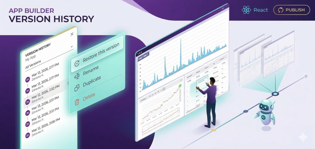
App Builder now has a built-in Versioning system — save named snapshots at any point, browse the full history, preview earlier states, and restore with confidence. Whether you’re experimenting with a major layout change or letting AI reshape a complex view, you have a safety net.
This release was covered in depth in the Build Fearlessly: Introducing App Builder Versioning post.
April 2026: Progress Components and AI Theme Extraction
New Components: Linear and Circular Progress Bars
Two new progress components are now available in the toolbox: Linear Progress Bar and Circular Progress Bar. Both support determinate and indeterminate states, covering the full range of loading, upload, and multi-step scenarios you’d encounter in a real application.
AI Theme Extraction from an Image
This one is genuinely useful: upload any image — a brand asset, a design reference, a screenshot of a UI you like — and AI will extract a color theme from it and apply it to your application automatically. It bridges the gap between “I have a visual direction” and “I have a consistent, token-based theme” in a single step.
Key Improvements
- AI-generated theme colors now use the correct token names — no more post-generation cleanup.
- Improved handling of invalid layout values generated by AI, producing more stable output.
- Actions persist correctly after page refresh.
- Default form inputs display correctly on the design surface.
- Improved selection and focus behavior when deleting items in a view.
May 2026: Tooltip Component and Faster AI
New Component: Tooltip
The Tooltip component is now in the toolbox. Attach it to any element to surface contextual hints or descriptions on hover — the kind of detail that makes compact, information-dense UIs usable without cluttering the layout with permanent labels. Learn more.
AI Speed and Efficiency
We significantly improved generation speed across the board. Every AI-assisted action is faster, and the lower overhead adds up across a session of active iteration.
Key Improvements
- Scrollbar styling is correctly scoped — it no longer bleeds into other components on the design surface.
- Layouts with auto scrolling scroll correctly on the design surface.
- Form elements maintain their correct size and layout.
- Component search returns accurate, deduplicated results.
Wrapping Up
Six months of releases, one clear direction: an app-building experience that gets out of your way. New components give you more building blocks, AI improvements make generation faster and more reliable, and the versioning system means you can experiment without fear.
Try App Builder → and let us know what you build next.