

新コンポーネントがリリースされました:Grid Lite、ナビゲーションタブ、AI UXの改善
App Builder、最新のナビゲーションおよびデータ体験を構築するための新コンポーネントと、大幅なAI能力の向上を導入しました。ぜひ試してみてください。
 Zdravko Kolev 1min read
 先週のApp Builderアップデートでは、最新のナビゲーションとデータ体験を構築するための新しいコンポーネントが導入され、AI機能の大幅な生活の質向上により、「テキストからアプリへの移行」のプロセスがよりスムーズで直感的になりました。
新しいナビゲーションタブコンポーネントはタブベースのナビゲーションを簡素化し、Grid Liteは軽量なタブ形式データの表示オプションを提供します。AI側では、コンテキスト編集やフィードバックの向上により、AI生成の変更の理解と制御が容易になります。また、生成AIを活用しながらデータ主権を確保するために、オンプレミスインストール用の新しいオフラインAI構成も導入しました。
これらの新機能について詳しく説明する前に、初めてApp Builderについて学ぶ場合は、組織のアプリケーション開発プロセスの主要なツールと見なすべき理由を簡単に共有しましょう。
- ビジュアルアプリビルダー –経営幹部、エンタープライズアーキテクト、開発チームリーダー、デザイナー、開発者、ステークホルダーのための統合プラットフォームです。
- クラウドベースの WYSIWYG ドラッグ アンド ドロップ ツールにより、企業はこれまでより 80% 速く完全なビジネス アプリを設計および構築できます。
- ローコード ツールは、Angular、React、Web Components、Blazorの量産対応コードを生成し、Figmaデザインをコードに変換します。
それでは、このApp Builderリリースの新要素を深く掘り下げていきましょう。
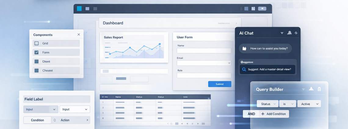
新しいコンポーネントを一目で見る
このリリースでは、ナビゲーションとデータ提示に焦点を当てた新しいコンポーネントが導入されました。試す前に詳細をご紹介します。
グリッドライト
時には、エンタープライズデータグリッドの重労働を必要としないこともあります。表形式のデータを高速できれいに表示する方法が必要です。
- **必須機能:**シンプルなリストや読み取り専用のデータビュー、または複雑なフィルタリングやソートよりもパフォーマンスが優先されるシナリオに最適です。
- **軽量性能:**スピードとシンプルさに最適化されています。
Grid Liteは以下の用途に最適です:
- 単純なデータテーブル
- 読み取り専用データビュー
- より高速なレンダリングシナリオ
これにより、完全なデータグリッドのオーバーヘッドなしで表形式のデータが必要な場合に非常に適した選択肢となります。
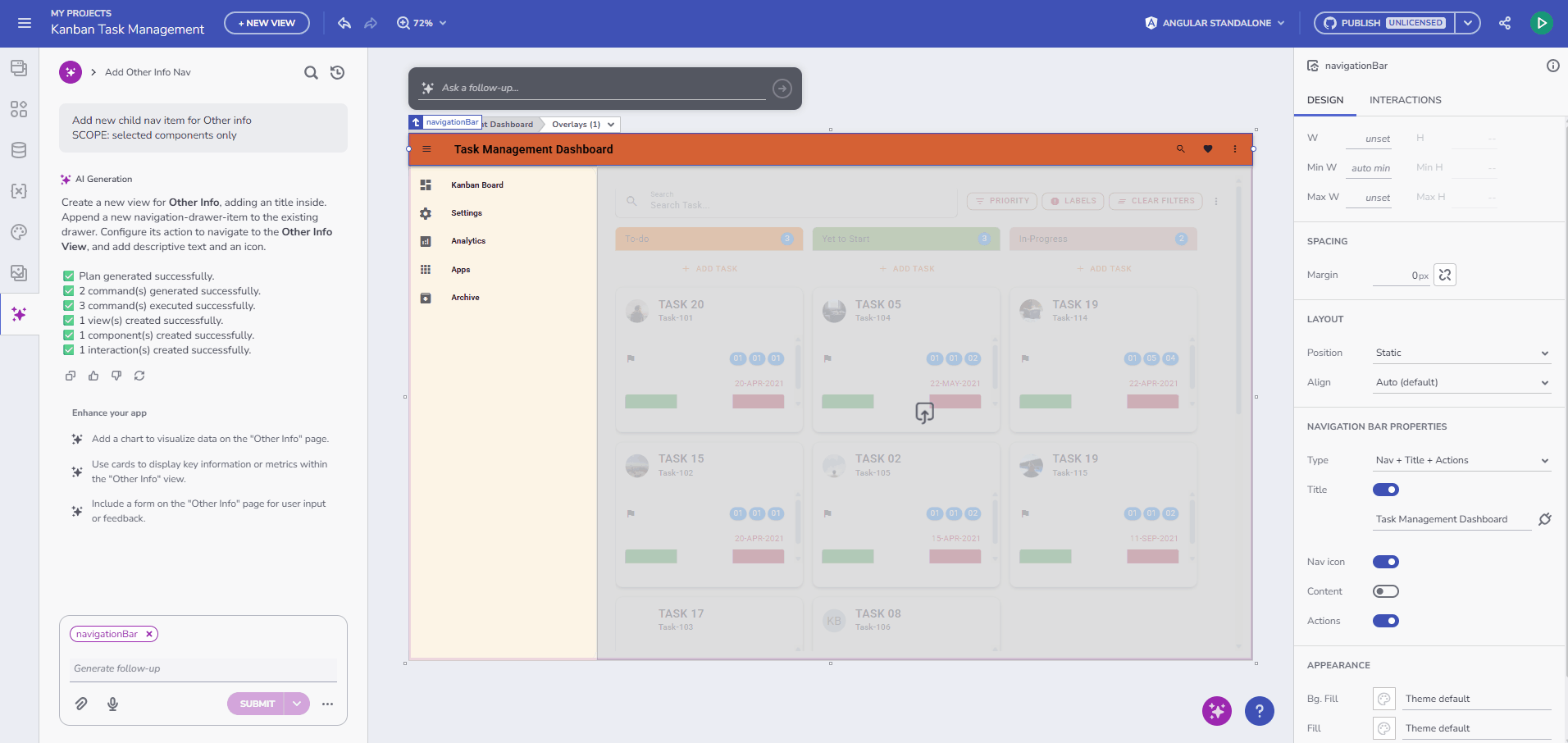
ナビゲーションタブ
タブベースのナビゲーションを構築するには、複雑な状態管理やルーティングロジックがしばしば必要になります。新しいナビゲーションタブコンポーネントは、この問題をすぐに解決します。
- **自動ルート選択:**コンポーネントは自動的にアクティブなルートを検出し、対応するタブを選択することで、UIが常にURLと同期していることを保証します。
- **シームレスな統合:**アプリレイアウトに直接組み込まれ、既存のルーティングシステムとネイティブに連携します。
このコンポーネントはダッシュボード、詳細ページ、マルチセクションアプリケーションに最適です。
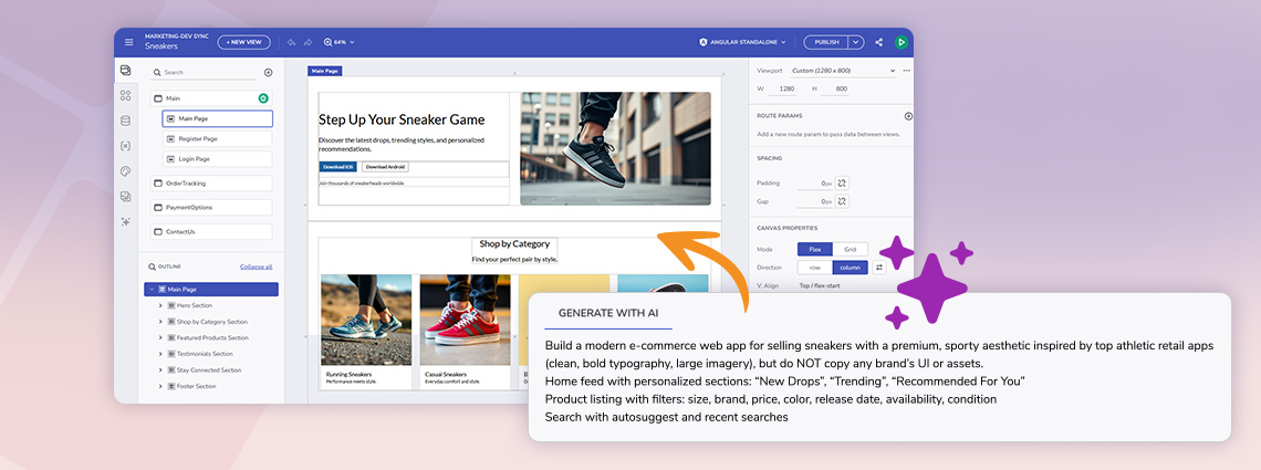
App BuilderにおけるAI:文脈的かつ情報的
AIは単なる「一度生成」ボタンであるべきではありません。仕事を磨く手助けをしてくれる副操縦士であるべきです。
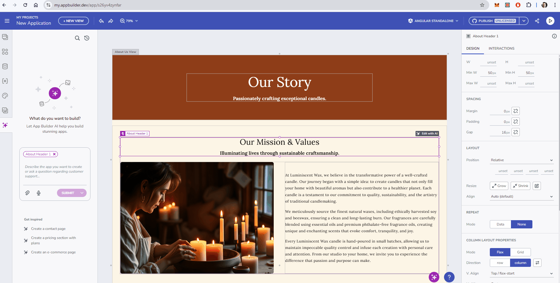
1. コンテキストに応じた「AIによる編集」アドーナー
これは反復設計において画期的な技術です。キャンバス上の選択されたコンポーネントに直接表示される折りたたみ式の「Edit with AI」アドナーを追加しました。
- なぜ役立つのか: AIの調整をするために現在のコンテキストを離れる必要はもうありません。グリッド、カード、フォームを選び、その場でAIに「カラースキームを変える」か「プロフィール画像を追加」を依頼します。
- **視覚制御:**折りたたみ式なので、不要な時は邪魔にならずに済む。
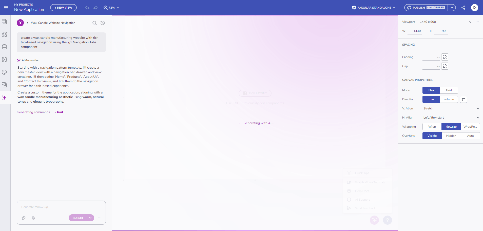
2. 強化されたAI進捗指標
AIへの信頼は透明性から生まれます。進捗指標を発電範囲を明確に反映するように強化しました。「AIで生成」ダイアログを見る代わりに、AIが何を作っているのか正確に見ることができます。データソースの生成、レイアウトの構築、テーマの適用など、プロセスの理解が深まります。
オンプレミスアップデート:自分だけのAIを持ち込む(BYOAI)
データのプライバシーとコンプライアンスが最重要視されるエンタープライズのお客様向けに、完全設定可能なオフラインAIサポートを導入します。ガイダンスの全トピックはこちらをご覧ください。
多くの組織がパブリッククラウドのAIプロバイダーにデータを送ることができないことは理解しています。このリリースにより、App Builderオンプレミはインターネット接続なしで完全に動作させる独自のAI設定を可能にしました。
- **エアギャップ能力:**ローカルのAIプロバイダーやモデルは、
ai.appsettings.jsonファイルを通じて直接設定できます。 - 総データ主権: GenAIの力を活用してUI作成を行い、安全なインフラからデータが一切出ないよう保証しましょう。
- **カスタムモデルコントロール:**どのモデルが開発を牽引するかは自分で決め、バージョン管理、速度、プライバシーのコントロールができます。
コンポーネントの改善
既存のコンポーネントも磨き上げ、レイアウトやロジックのコントロールを強化しました。
- カードコンポーネントの柔軟性:これで幅と高さの柔軟なサイズ設定に完全に対応できます。また、デフォルトの寸法やレイアウトの挙動も改善し、カードをキャンバスに置いた瞬間から素敵に見え、デフォルトでレスポンシブに対応できるようになりました。
- ステッパー検証ロジック:ステッパーステップにプロパティをバインドするサポートを追加
isValid。これにより、マルチステップウィザードの流れをプログラム的に制御でき、特定の検証基準(例えばフォームの入力)が満たされるまでユーザーが進めないようにできます。
まとめ
このリリースにより、App Builderがデザインとコードの橋渡し役としての地位を強化します。スピード向上のための軽量コンポーネントと生産性向上のための高度なAI統合の両方を提供することで、チームがより良いアプリをより速く提供できるよう支援しています。
新機能をぜひお試しくださいmy.appbuilder.dev
App Builderは、アプリ開発プロセスにおけるゲームチェンジャーです。クラウドベースのビジュアルビルダー、ローコード機能、新機能など、あらゆる組織にとって必須のツールです。今すぐお試しください!詳細については、以下をご覧ください。
最新のApp Builderアップデートのすべてを体験するには、カスタマーポータルにアクセスして最新バージョンを入手してください。いつものように、私たちはあなたのフィードバックを受け取り、あなたが追加したいものや推奨したいものを聞くことに常に興奮しています。ですから、zkolev@appbuilder.devにメールを送って、Infragisticsで顧客に価値を提供し続けるために私たちがどのように支援できるかを教えてください。